Widgets
3 Adding content to dashboards
Section titled “3 Adding content to dashboards”3.1 Widgets
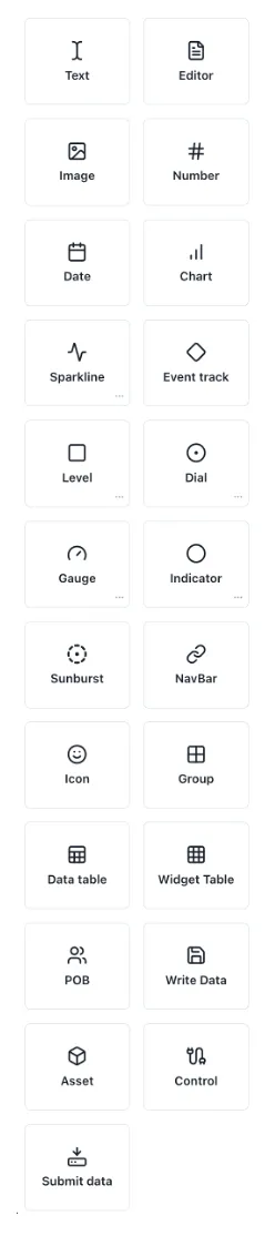
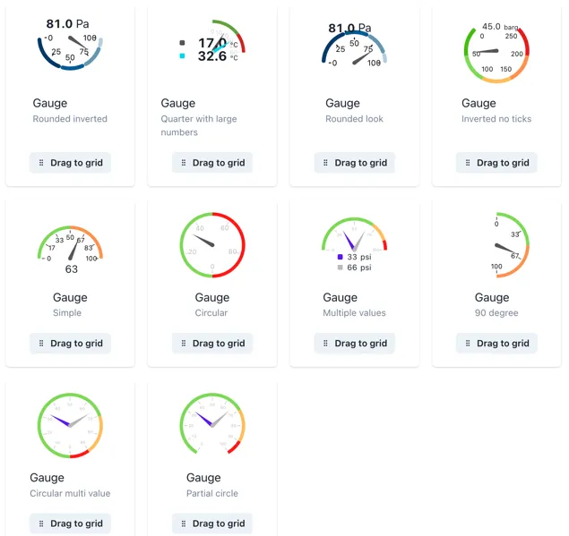
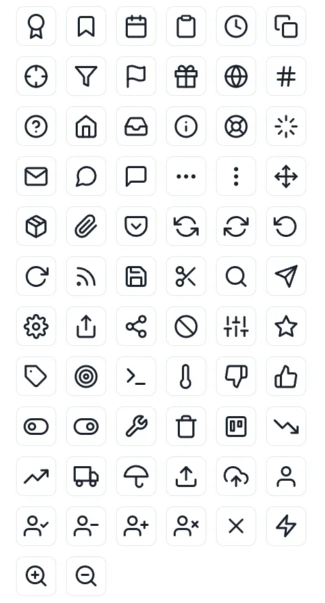
Section titled “3.1 Widgets”While on edit mode in your dashboard, you will see the Widget’s menu on the left side of the page. The widgets available are shown below.
3.1.1 Adding a widget
Section titled “3.1.1 Adding a widget”To add any widget, drag and drop its icon onto the dashboard. Clicking the three dots […] in the bottom right corner of brings up a popup of the available pre-configured templates for that component
3.1.2 Editing a widget
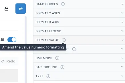
Section titled “3.1.2 Editing a widget”When the dashboard is in “Edit” mode, the menu on the right side will show the editing menu of the selected widget. This widget menu includes different sections you can navigate to modify the widget. A short description of each section of the widget menu can be found when hovering over the info icon on the right side of the sections.
The next sections will cover the basics on how to set up these widgets.
3.1.3 Text
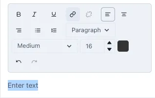
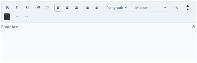
Section titled “3.1.3 Text”To add text to your dashboard, drag and drop the text widget from the widget menu into the grid. Under the “Text Editor” section you can modify the content and style of the text. Write the text in the “Enter text” space and style it as preferred.
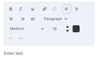
You can make the text bold, italics or underline it, change the alignment, type of text, enumerate lists and size of the text. To change the size of the text you can choose an option from the drop-down menu or, for a more precise size, change the size of the text by selecting it and changing the letter size.
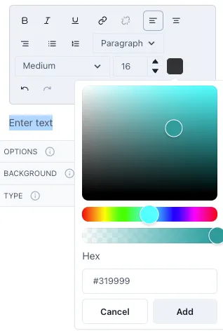
To change the color of the text, select it and then click on the color box next to the letter size. A small menu will open with some preconfigured colors. To add a different color, click on “Add color”. Where you can select from a wider range of colors and the opacity of the color. Underneath you will see the Hex code for the color you selected yet you can also input a specific Hex code in this section.
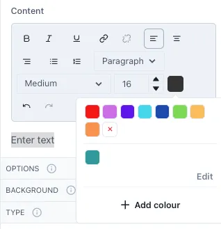
The colors you add will be saved and available for easier access in the future.
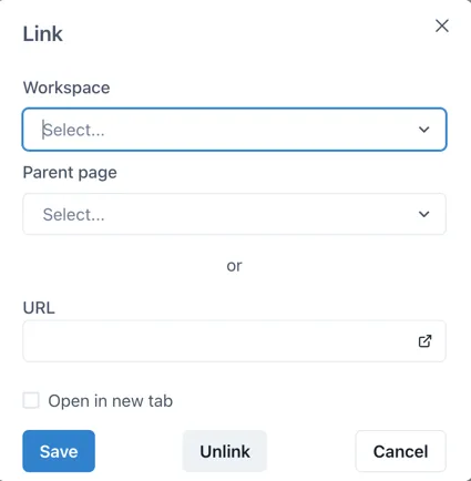
To link the text to other Ingenuity 7 pages or external URLs, select the text and click on the hyperlink button.
This will open the following window where you can select the Workspace and Page you wish to link it to within Ingenuity 7 or add a link to an external URL. If you wish to have the linked page open in a new tab, click on the checkbox “Open in a new tab”.
3.1.4 Editor
Section titled “3.1.4 Editor”An editor widget allows you to allocate a space in the dashboard where users can edit text without switching the dashboard to edit mode. This is particularly useful for reports when you wish to add comments or notes on the values reported. When you go out of edit mode, the Editor widget will have an edit icon on the top right. Select this icon to edit the text inside the editor.

Edit your text as you would in a text widget. When done, you can select the close icon located where the edit icon was previously, this will hide the edit menu and give it the seamless appearance it had before. Inside the editor you can style your text in the desired format, enumerate lists, change the color and size of the text and link text to another Ingenuity 7 page or to an external URL.
3.1.5 Image
Section titled “3.1.5 Image”To add an image drag and drop the image widget into the dashboard. On the right-side menu open the Image section and then ‘Choose a new image’ to upload the preferred image. You will get a preview of the image where you can crop the image if the Fit is set to contain or select the area of the image that you want to focus on if the Fit is set to cover.
When you set an image with the Fit as contain, the image will always include the whole area selected in the preview, and if resized in a smaller size in the dashboard, it will scale the whole image to fit in this area. If the Fit is set to cover, it will focus on the area but will not scale the whole image to fit into the image size selected. The following image shows the difference between an image set as contain (left) and cover (right) in the same size.
3.1.6 Number
Section titled “3.1.6 Number”After dragging a number widget to the dashboard, you can open the Value section in the right-side menu to add a value to this number.
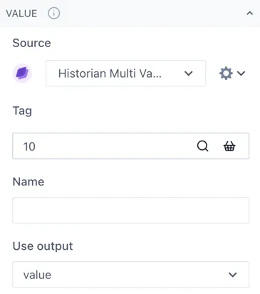
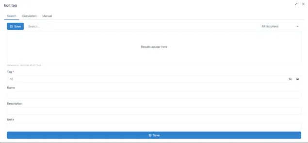
If you wish to have a fixed value, just type the number under Tag. Otherwise, you can click on the magnifying glass to open the edit tag window. If you click on the Search tab you can look up a specific tag or you can start a calculation under the Calculation tab. If you are searching for a tag and cannot find it, verify you have the correct data source under the Value section of the widget menu.
Name will be like a nickname for the tag or calculation you are using, to make it easier to identify rather than having to remember tag numbers. You can change the Name, Description and Units of each number you add.
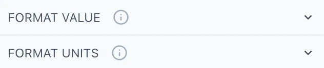
Going back to the widget menu, under the Format Value section you can adjust the style of your number as well as the decimal places shown, the alignment, thickness, size, etc. Under format units you select if you wish to display the units of the number and how to display them.
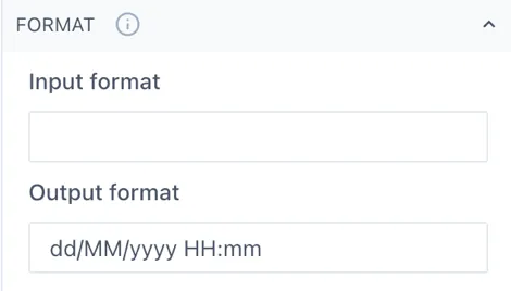
3.1.7 Date
Section titled “3.1.7 Date”The date widget will show the current date and time when you add it to the dashboard. You can change the date format under the Format section in the right-side menu. Remember that m stands for minutes and M for months.
3.1.8 Chart
Section titled “3.1.8 Chart”Charts can be set to live mode by activating the toggle Live on the top left corner of the chart. This will show you the period selected until the current date, you can change this period by selecting an option from the drop-down menu or by selecting Custom from the same menu and typing the preferred period of time.

This would be for example, 2M for 2 months. Other valid entries would be:
| s: | seconds |
| m: | minutes |
| h: | hours |
| d: | days |
| w: | week |
| M: | month |
| y: | year |
If you deactivate the live mode, the date selection next to the toggle will be available to select he specific dates you want to look for, or you can still use the drop-down selection menu. Once a chart is not in live mode, it will remain in the specified period, it will not be automatically updated. While live mode is deactivated you can quickly navigate through time with the back-and-forth buttons.
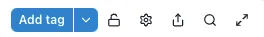
On the top right of the chart, you will see the following options.
You can add a new tag by clicking on the Add tag button or by dragging and dropping a tag from your basket. Another way to add a tag would be to go on Edit mode and select the Chart widget, opening its menu on the right side of the page. Under the Datasources section you will be able to add a new tag or modify the existing ones.
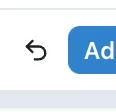
By default, the charts are “unlocked”, which allows users to zoom in by selecting a specific part of the chart and change the axis by scrolling while hovering over the axis. To revert the chart to its original position before zooming in, click on the undo button that will appear to the left of the Add tag button.
If you wish to keep the chart “locked in” or fixed, you can click on the lock button to set it fix. This is very useful when having dashboards and reports with multiple charts in them where you must scroll down to look at all the content.
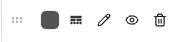
In the cog wheel you will find some settings options such as the legend display, edit axis and title, and download options. The share button will open the chart in a new page, where you can save it or copy the URL to share it with more users.
The magnifying glass opens the chart in a pop-up window, allowing you to look at it in more detail, the changes done on the pop-up chart will not affect the original component. This option is ideal when you wish to look more into detail in a specific chart on a dashboard that contains several charts or widgets in it.
The last button with the arrows allows you to set the chart in seamless mode, hiding the top menu. To go out of seamless mode you click on the same button.
To edit the axis of the chart, you can click on the cog wheel in the top menu and select Edit Axes or directly select the cog wheel next to the axis.
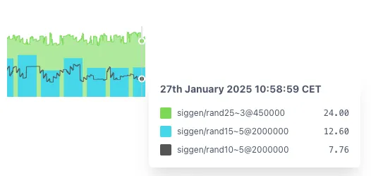
In the legend you will be able to see all the tags and calculations on the chart and edit how they are displayed on it. It is recommended to add a name to each tag or calculation to identify them easily while on a chart.
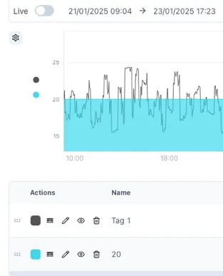
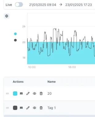
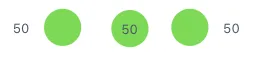
The 6-dot selector allows you to change the order of the tags included in the chart, the values added last will be displayed on top of the previous ones. Rearranging this order is important when you have a chart with lines, areas, bars, etc. To bring front a specific tag, move it to the bottom of the legend. See the next image as reference.
The rounded square button allows you to change the color of your tag or calculation. In the button with lines and dotted lines you can change the line of our tag from solid to dashed, dotted, etc. and change the line weight and point radius of it. The pencil button opens the tag or calculation, name, units and description. The eye button hides and unhides tags from the chart temporarily and the bin button deletes the tag from the chart.
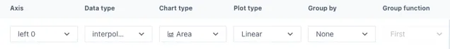
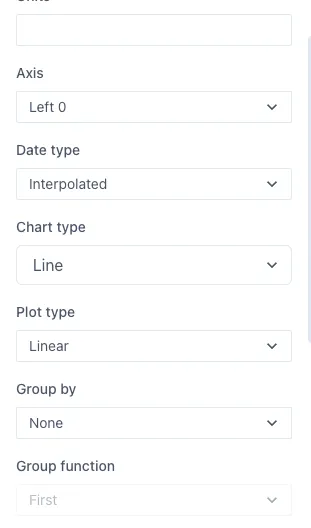
Next we have the units and description of the tags in the chart as well as the axis in which they are shown, data type (auto, interpolated, raw), chart type (line, area, stacked area, bar, stacked bar, points and lines and points), plot type (linear, step, step before, step after, best fit), grouping (none, by hour, day, month, etc.) and group function if the data is grouped by.
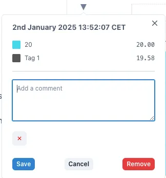
To add markers to your chart, hover over the point you want to mark and click the space bar. This will add a subtle vertical marker in this position. To add a comment to this marker, you can click on the little triangle above the marker.
Further information on the Chart widget and its configuration can be found in the Charts Product Manual.
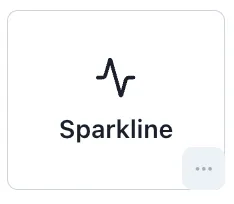
3.1.9 Sparkline
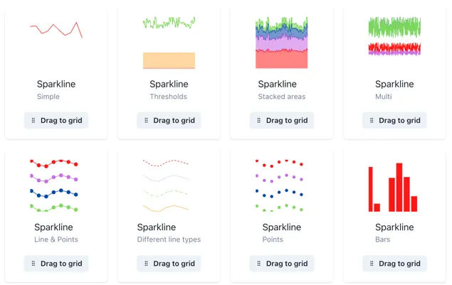
Section titled “3.1.9 Sparkline”Sparklines are full Charts in disguise, therefore, they can be modified in the same manner as a Chart. You can explore different examples of sparklines by clicking the three-dot button in the sparkline option.
To add any of these templates to your dashboard just drag them into the grid and you can start editing them.
You can add the value under the Datasources section of the menu, clicking on the magnifying glass to add to search for tags or making calculations, making sure you have the correct source from the drop-down menu before.
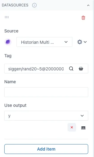
By clicking the Add item button below, you can keep on adding several values to the Sparkline as desired and the cog wheel next to the sources drop-down menu will open more options to modify the data shown such as the data type, chart type, plot type and if any grouping on the data.
Same as in a chart, you can overlay several values with different chart types to create more complex displays. When out of edit mode, you can see the values within the sparkline by hovering over it.
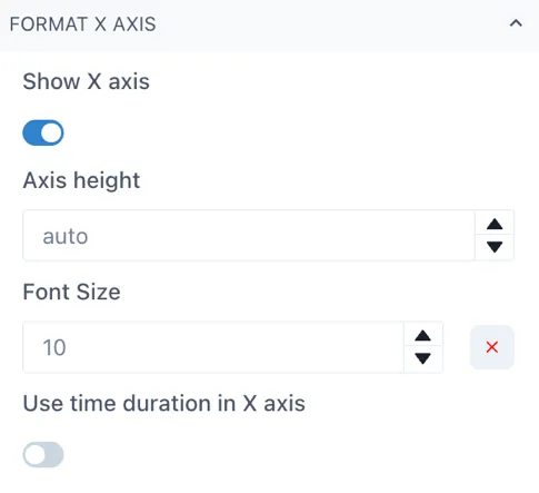
To modify the axes height, you can select the Format Y Axes or Format X Axis depending on the axis you wish to change. For the X axis, simply open the Format X Axis section and change the Axis height, it is by default on auto, but you can change it by clicking on the arrow button or by typing the number. Be sure to have the Show X axis toggle activated to see the changes you are implementing.
To change the Y axes, open the Format Y Axes section in the menu, you will see in bold the Y Axes you have in your sparkline or chart at the moment.
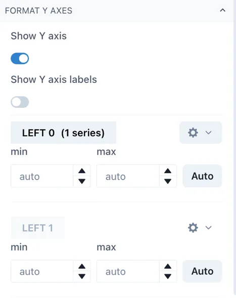
There are 4 left Axes and 3 right Axes in which you can chart your trends. Click on the cog wheel next to the axis you wish to change and then scroll down to the axis area width to modify the space between the widget edge and the axis.
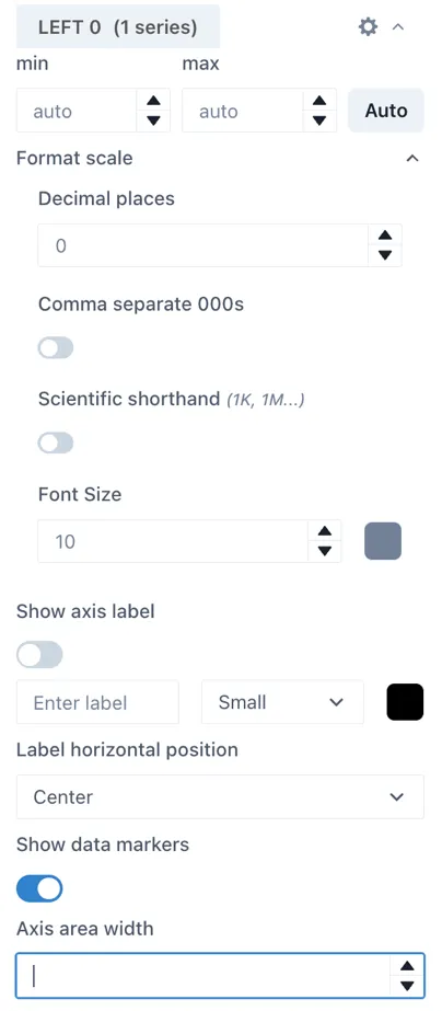
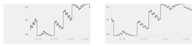
By default, the sparklines have a wide area between the edge of the widget and the beginning of the Y axis to accommodate for situations where you have several Y axes. Next, we have an example of a default sparkline and a sparkline with an area width of 24 for comparison while on edit mode. This translates to a sparkline or chart that occupies more of its widget space.
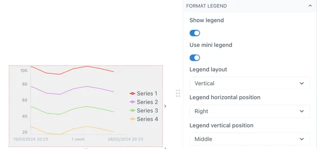
You can add or modify the format of a sparkline in the Format Legend section of the menu. In this section you can toggle the Show legend to activate it and the Use mini legend toggle to select between the mini legend or the more extensive legend. While working on a sparkline, it is recommended to use the mini legend to use the space more efficiently.
You can edit other aspects of the legend under the same section of the menu such as the legend vertical and horizontal position, the legend width, font size and if you want to wrap the levels. Next is an example of how you can modify mini legend for a sparkline.
3.1.10 Level
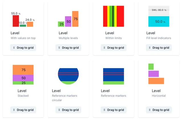
Section titled “3.1.10 Level”Levels can have one or multiple values within the same widget. You can see some level templates or examples in the three-dot button in the Level section of the Widget menu.
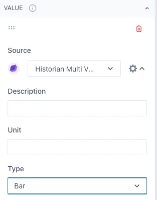
Under the Value section of the widget menu, you can select the tags or calculation you want to display in a level as well as adjust its color. In the cog wheel next to the source, you can see more options to modify this item. Under Type, you can select if you want to display it as a bar or a line in the level. The line option is ideal for displaying a threshold value of reference for the tag you are evaluating.
Under the Min/Max values section of the menu, you can adjust these values by changing the fixed value or using a tag or calculation for the minimum and maximum of the level.
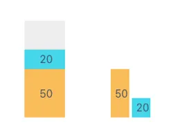
You can display or hide the values of the level in the Format value section. If you add multiple items in the same level as bars, they will be initially set as stacked bars. If you wish to change this, go to Format bars and change the Stacked bars toggle.
3.1.11 Dial
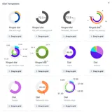
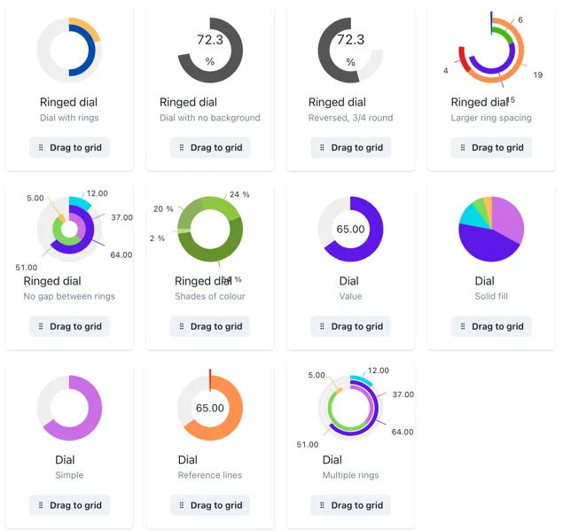
Section titled “3.1.11 Dial”Dials can have one or multiple values in the same widget. Explore some of the dial templates in the widget menu, you will find an ample selection of options with one or multiple rings.
Tags and calculations can be added in the Value section of the widget menu, and you can keep adding items as desired. Initially, values are set as slices of the dial, but you can change them as lines by clicking the cog wheel next to the source and changing the Type to Line.
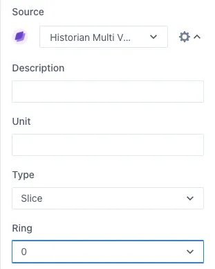
You can have multiple rings on the same dial, to change an item to another ring, change the Ring number in the same cog wheel button.
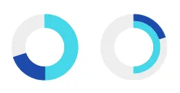
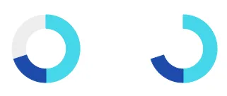
Change the minimum and maximum values in the Min/Max Values section and display or hide the values in the Format Value section. Under this section you can also decide if you want to show the background of the dial, meaning the “empty” space between the value and the maximum value. Here is an example of a dial showing and hiding this background.
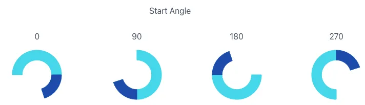
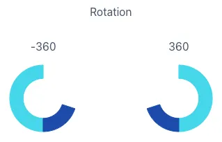
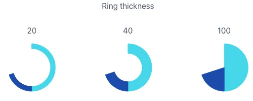
Under the Format rings section, you can modify the start angle of the rings, dial size and rotation direction, ring thickness and the gap between rings. Here are some examples of how these values change the dials.
3.1.12 Gauge
Section titled “3.1.12 Gauge”In gauges, the main value you add will be identified by the needle and the value at the bottom. Several templates of gauges can be found in the widget menu in the three-dot button in the Gauge widget.
You can change the minimum and maximum values of the gauge as well as adding different threshold values as reference.
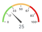
The threshold values act like a dial or level with several stacked values, and it is recommended for better visual display that the sum of the thresholds is equivalent to the maximum gauge value. Here is an example of a gauge with 3 threshold values of. 33.33 each and a maximum of 100.
Remember that the thresholds act like a stacked bar or value, therefore, you might need to make small adjustments or calculations to display the thresholds correctly.
You can change the ring format in the same way as with a dial and style the ticks within the gauge to optimize the widget to your needs.
3.1.13 Indicator
Section titled “3.1.13 Indicator”Indicators allow you to compare a tag or calculation with one or several criteria and define a status based on that. You can add a value and their criteria In the Value section of the widget menu. Both the value and the criteria can be a manual value, tag or calculation.
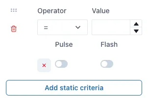
Indicator — Static Criteria
Section titled “Indicator — Static Criteria”Static criteria are fixed numbers to compare the value to. For example, ”> 5” means greater than 5. To add static criteria, select the Add static criteria and fill out for the manual criteria.
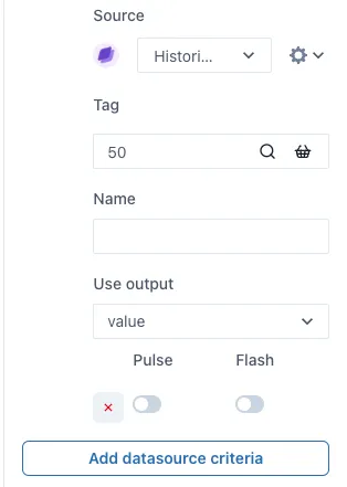
Indicator — Data source Criteria
Section titled “Indicator — Data source Criteria”Data source criteria are dynamically queried from other data sources. To use a tag or calculation (or other data source) instead of a fixed manual criteria, select the Add data source criteria button.
Under the Graphic section of the menu, you will find more indicator shapes such as triangle, square, etc. and more categories of indicators with different shapes within them.
When working with graphics, it is useful to display the value that you set to the indicator. You can do this by activating the Show value toggle in the Format Value section of the menu. You can define the position of the value to the left, center or right of the graphic indicator.
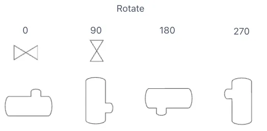
To rotate graphic indicators, you can open the Format indicator section and change the value under Rotation. Use the up and down buttons to change the rotation slightly or type in the degrees you would like the indicator to rotate. Next you have an example of the rotation of an indicator.
3.1.14 NavBar
Section titled “3.1.14 NavBar”The NavBar widget allows you to create a Navigation bar or button that links to another page within Ingenuity 7 or an external URL. Select the workspace and the parent page you wish to link it to and add a label, which will be the text to click on to navigate to that page.
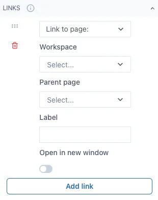
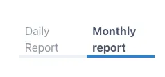
If you wish to link to an external URL, change “Link to page:” to “Link to URL” and fill out the information needed. Here is an example of what a NavBar looks like out of Edit mode and linking to 2 spaces. The highlighted option means you are currently on the page that option is linked to.
The initial layout will be horizontal, but you can rearrange this widget to have a vertical layout by changing the size of the widget in the dashboard.
When linked to another dashboards or pages within Ingenuity 7, it will redirect to that dashboard even if the dashboard changes name or if it is moved to another workspace.
3.1.15 Icon
Section titled “3.1.15 Icon”You can add a variety of icons to your dashboards to further improve their appearance. The icon widget contains several categories of icons such as alerts, arrows, charts, media, notifications, etc. Below is an example of the icons that can be found in this widget.
3.1.16 Group
Section titled “3.1.16 Group”The group widget allows you to group several widgets by putting them inside the group widget. Once they are inside the group widget, you can move the group widget in the dashboard and relocate all the widgets inside it easily. This is ideal when you have several text, numbers and indicators widgets you wish to move or copy, since you can copy a group widget with all the widgets inside it rather than doing so individually. This works for all the widgets, graphics and lines inside the group widget.
3.1.17 Data Table
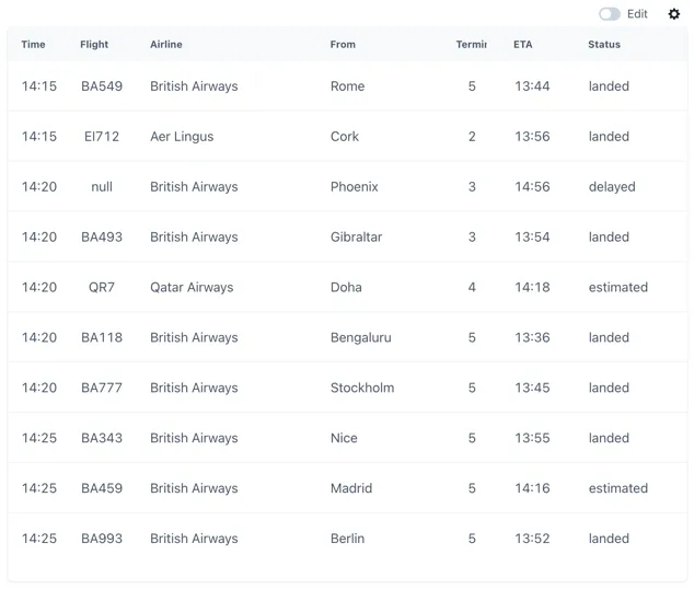
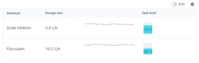
Section titled “3.1.17 Data Table”Data tables are ideal for displaying different data or parameters from one single data source. Next is an example of what a data table looks like out of edit mode.
To set up a data table first you select your data source in the Source section of the widget menu, depending on the source you select you might have to type more information such as an airport code if you are displaying flight data.
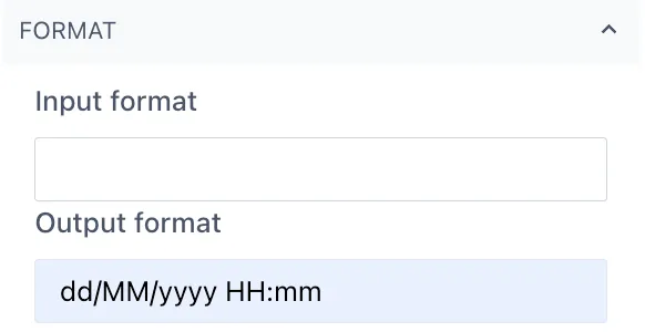
Next you should go to the Columns section in the menu and select Add column. The name will be the column name, and you can select the primary output option of this column. Under Type is important to match the type of data you wish to display from this column, for example Date or Text. If you are selecting Date, remember you can set the date format under the Format section under the date column.
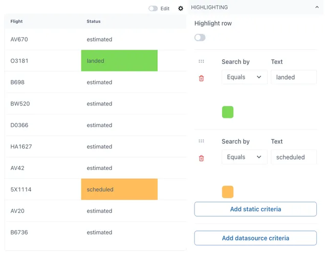
You can add highlights to your table when the value in a row from that table matches your criteria. Criteria can be static or based on a data source, and it is case sensitive when working with text values.
3.1.18 Widget Table
Section titled “3.1.18 Widget Table”Widget tables are designed for the case where you need a repeating pattern of components for sets of identical equipment or datasets. For example, if you have a hotel with an airconditioning unit in each room measuring temperature, pressure, humidity and CO2. Each row can be a different room.
Widget tables can include different types of widgets in them, and they provide the possibility of linking each widget to their own distinct data source. This is ideal for joining data from multiple sources in a single table for easier comparison between them. The following is an example of what a widget table can look like, this will very according to the widgets you wish to use in your widget table.
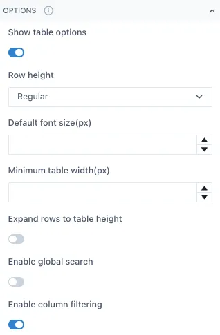
To modify a widget table, adjust the table settings such as row height, minimum table width, etc. under the Options section of the widget menu.
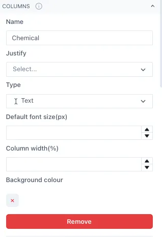
Next, set the number of columns and what type of data each will have under the Column section. The data type can change between columns but should remain the same within the rows of the same column. It is recommended to add names to each column but leaving the Name blank is also an option.
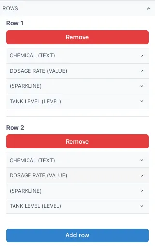
Once you have set up the columns, open the Rows section and start adding the Row 1 of your columns. Under each Row you should see all the column categories you set before.
In this example we have 4 columns, each with different type of data and one of them without a name for the column. This set up would give the following table as result.
You can adjust the column width per column under the Column section of the menu, this will allow you to optimize the fit of the widgets in your table. Simply type a number between 0 and 1, taking into consideration that the sum of the columns should give 1 as total.
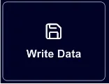
3.1.19 Write Data Component
Section titled “3.1.19 Write Data Component”The Write Data component looks like this in the left-hand panel of widgets when a dashboard is in edit mode.
Write Data Button Configuration
Section titled “Write Data Button Configuration”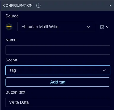
Source: By default, this is set to the Historian Multi Write data source. It is unlikely that this would need to be changed as this data source supports all configured writeable historians in the Ingenuity 7 subscription.
Name: This field is not used but may be useful if there are more than one Write Data buttons on a page
Scope: this determines where the button looks for the list of tags to write to. The options are:
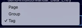
Tag: the list of tags is configured in the Configuration of the button
Page: the list of tags comes from the tags on the page that are flagged with “Enable write”
Group: the list of tags comes from the tags in the same group as the Write Data button that are flagged with “Enable write”
Write Data Button Scope
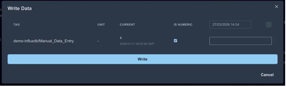
Section titled “Write Data Button Scope”Scope = Tag
The list of tags is set directly in the Configuration section as shown in the screenshot below
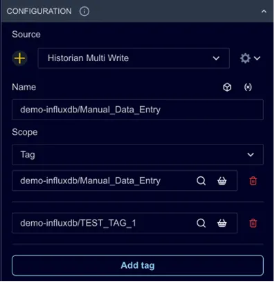
Multiple tags can be configured by clicking Add tag. The full tag will be displayed in the form that pops up to write data.
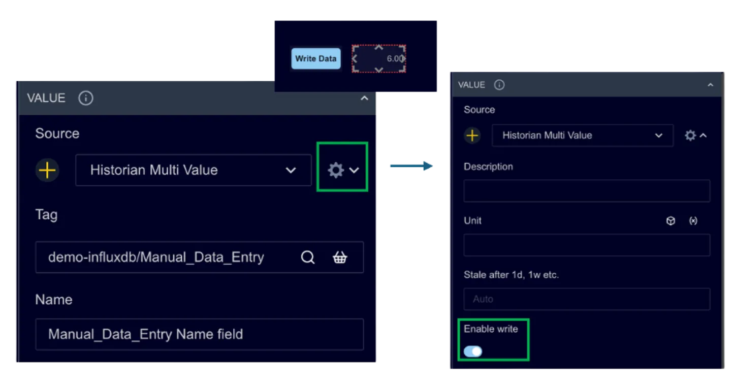
Scope = Page
The list of tags comes from the page. The code looks for any historian tag on the page that has been flagged to “Enable write”. For example, the Write Data button in the screenshot below will pick up the tag in the Number component to the right if “Enable write” is set to true under the Settings (cog wheel icon) in the Source configuration
Scope = Group
The list of tags comes from the Group that the Write Data button belongs to. This works the same way as the Page scope above, but the button only looks at tags in the same group on the dashboard. If the button is not part of a group, it will not pick up any writeable tags.
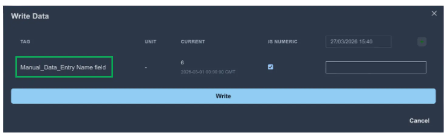
This can be useful for users when the tag name might be complex or not intuitive. Using a more user-friendly name can make it easier for users to enter the correct data.
Other Configuration Options
Section titled “Other Configuration Options”The other configuration options determine the button’s appearance on a dashboard and the default settings for the popup form.
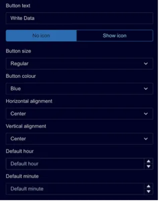
Button Text: The text to show on the button. By default, it is set to “Write data”.
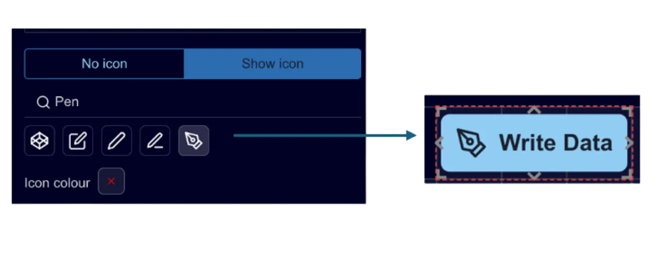
No icon/Show icon: set this to “Show icon” if you would like to add an icon to the button. A search box appears. Type in words that describe the kind of icon you would like and select from the available options as shown below .
Button size: Select from pre-defined sizes:
- Extra Small
- Small
- Regular
- Large
Button colour: select from pre-defined button colours.
Horizontal alignment: this determines where the button sits horizontally within its frame as the page scales. It gives flexibility to make sure the button is always positioned as desired on wider screens.
Vertical alignment: this determines where the button sits horizontally within it’s frame as the page scales. It gives flexibility to make sure the button is always positioned as desired on larger screens.
Default hour: this is used to set the default hour of the timestamp to write data for. Setting it to ‘0’ will set the hour to midnight.
Default minute: this sets the default minutes after the hour.
Background Configuration
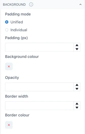
Section titled “Background Configuration”The Background configuration is that same as any other dashboard component and gives users very granular control on the padding, corner rounding, shadow and borders.
Type Configuration
Section titled “Type Configuration”Not used.
Using the Write Data Widget
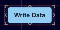
Section titled “Using the Write Data Widget”Drag and drop it onto a page and it shows as a blue button with the text Write Data.
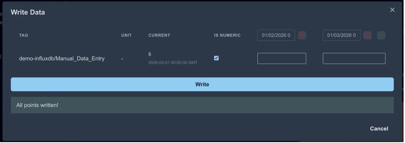
When the button is clicked, a form pops up for the user to enter the data to write.
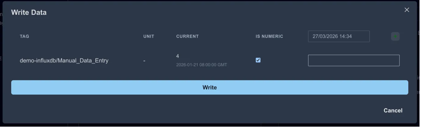
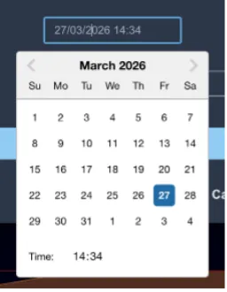
The timestamp can also be adjusted.
Multiple values can be written by clicking the [+] icon at the right-hand side
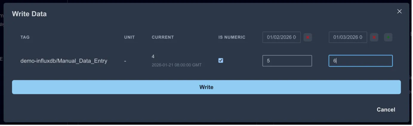
Click “Write” to write the points to the data source(s).