Creating Dashboards
2 Creating and editing dashboard
Section titled “2 Creating and editing dashboard”2.1 How to create a dashboard
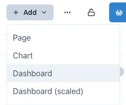
Section titled “2.1 How to create a dashboard”To create a dashboard, open the workspace you wish your dashboard to be under, click the Add button on the top right of the page and select the type of dashboard you wish to add.
2.2 Editing a dashboard
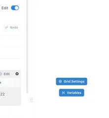
Section titled “2.2 Editing a dashboard”When you first create a dashboard, it will open in Edit mode. To put a dashboard in Edit mode at any other time, just click the “Edit” toggle in the top right corner. A configuration panel will appear on the right hand side.

2.3 Grid Configuration
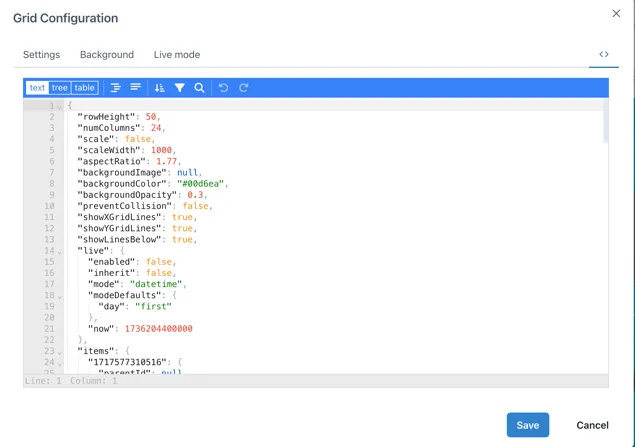
Section titled “2.3 Grid Configuration”Each type of dashboard has different grid settings applied to it. To change the grid settings of any dashboard or page, click on “Grid Settings” in the right-side menu when in Edit mode. If you cannot see this option but see the configuration menu for a widget instead, click on an empty space in the dashboard or page to access it. This will open a window with four main sections, which we will cover next.

2.3.1 Settings tab
Section titled “2.3.1 Settings tab”In the Settings section, we can adjust the number of columns and the height of the rows, enable or disable the vertical and horizontal guides, the lines below the graphics, prevent collision, the scaling of the dashboard and the aspect ratio.
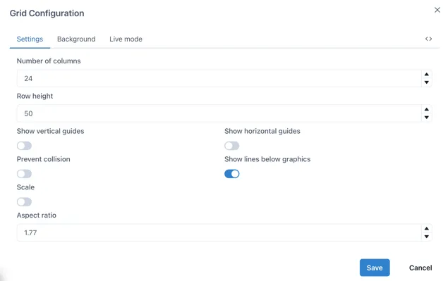
The vertical and horizontal guides are what makes the grid visible while on Edit mode. These are ideal to use as reference when you want to place widgets perfectly aligned. To change the size of the grid, change the number of columns and the Row height.
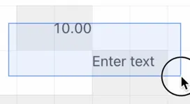
Disabling “Prevent collision” will allow you to overlay widgets, which is ideal for having images or graphics with data on top of it.
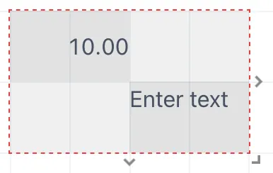
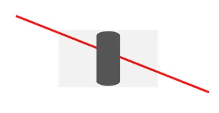
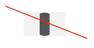
The “Show lines below graphics” will make the lines added from the Lines’ menu sit behind the graphics overlaid on them. This difference can be seen in the following image.
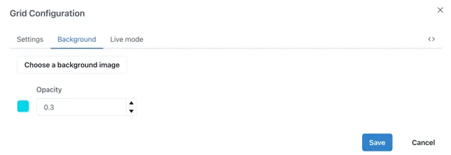
2.3.2 Background tab
Section titled “2.3.2 Background tab”In the background section you can upload a background image or set a background colour. Remember you can adjust the opacity, 0 being completely transparent and 1 being not transparent at all.
2.3.3 Live mode tab
Section titled “2.3.3 Live mode tab”The Live mode lets you activate live mode for the dashboard, allowing widgets to be set to the current time. You can also choose whether the widgets should inherit these settings or maintain their own configuration as well as changing how often the data will update.
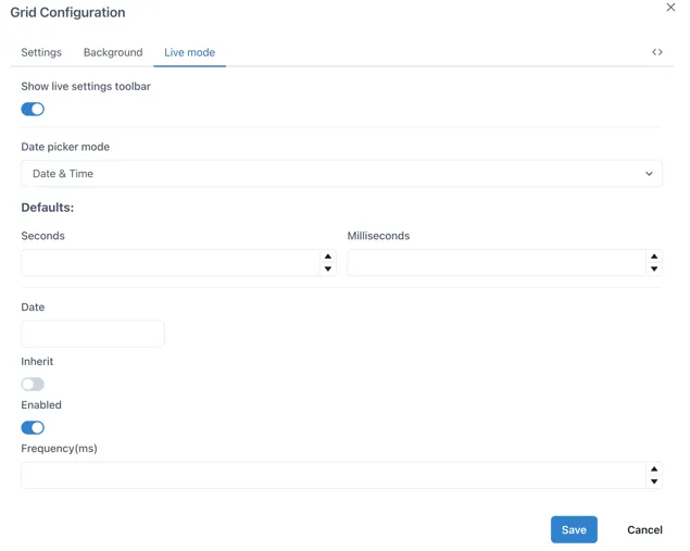
Showing the live settings toolbar will show a Live toggle on the top of the dashboard, which can be activated or deactivated and will change all the widgets in the dashboard to this time frame. When the toggle is off, you can select a specific date to set all the widgets to.
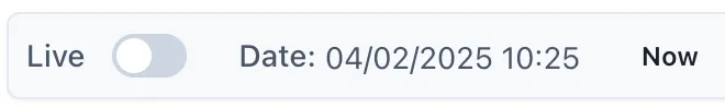
If you select a specific date in the Date section, the Live mode will be turned off and the data will not be updated, rather displayed for a fixed time frame according to your selection.
2.3.4 Editing JSON code
Section titled “2.3.4 Editing JSON code”The last section in the Grid configuration menu allows us to see the JSON code for the whole dashboard and it is signaled by the following button.

To copy the current dashboard to another page or dashboard, we can select the “text” option and copy all the code of the desired page into the code of the page where we want the copy to be in and click save. This will replicate the whole dashboard with all its widgets configured with the data sources from the original dashboard if available, yet images will have to be uploaded again in the destination page.
Each widget on the dashboard will have their individual JSON code, therefore if you wish to copy a single widget from a different dashboard into your own, you can access their JSON code by clicking on them while on Edit mode and selecting the JSON button on the bottom of the right-side menu.
2.4 Selecting, Moving and Grouping objects
Section titled “2.4 Selecting, Moving and Grouping objects”2.4.1 Selecting individual and multiple objects
Section titled “2.4.1 Selecting individual and multiple objects”To select an object, move the mouse pointer over it and click once. To select multiple objects, either hold down the shift key while you click on each one, or click and drag the mouse pointer to draw a box over them:
2.4.2 Moving objects
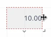
Section titled “2.4.2 Moving objects”Objects can be moved when the mouse pointer is within the boundaries of the component and the pointer has changed to a “move: icon - a 4-pointed arrow. Click on the object and hold to move it around as you would with any other drawing package.
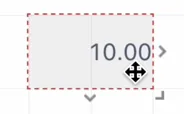
To resize an object, move the mouse pointer over one of the 3 ”>” markers on the right, bottom or bottom right and the cursor will change to a “resize” icon — a two headed arrow in the directions the component can be resized:
When multiple objects have been selected, the right hand panel automatically changes to the alignment tools:
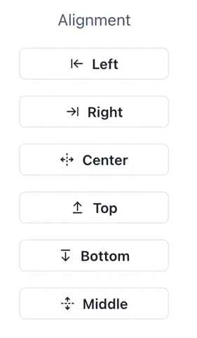
These are especially useful in a scaled dashboard where there is no grid to aid alignment.
Right-clicking on a selected object brings up a shortcut menu with available options:
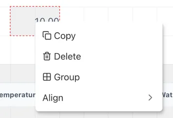
The Group and Align options only appear when more than one object is selected at the same time.
2.4.3 Grouping objects
Section titled “2.4.3 Grouping objects”Clicking the “Group” option automatically adds a Group component with the selected components in it.