

Formatting a Series
2.5 Formatting a Series
Section titled “2.5 Formatting a Series”2.5.1 Series Settings
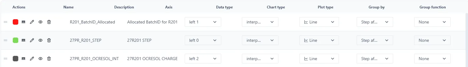
Section titled “2.5.1 Series Settings”![]()
Below the chart are the settings for each series. If they are not visible, then simply click and drag the 6-dot icon shown above (centre of the page under the chart) up to reveal the settings. It is also possible to hide the settings by dragging the icon down.
2.5.2 Actions
Section titled “2.5.2 Actions”For each Series, there are many things that are configurable.
| To re-order the series, drag the 6-dot icon up or down. | |
| The Serie colour can be changed by clicking the colour dot. | |
| To change the style of the line, click this icon. It is possible to change the line style (solid, dash, dot etc.) as well as the weight. | |
| Set or change the Name, Description and Units of the Series using the ‘pen’ icon. | |
| Clicking the ‘eye’ icon hides or unhides the series on the chart. | |
| A Serie can be deleted by clicking the bin icon. |
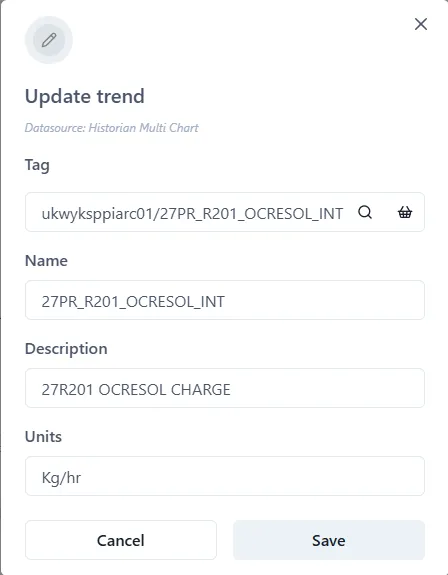
2.5.3 Name, Description and Units
Section titled “2.5.3 Name, Description and Units”As well as clicking the pen icon,
![]() , right clicking the Name or Description allows these to
be changed.
, right clicking the Name or Description allows these to
be changed.
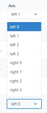
2.5.4 Axis
Section titled “2.5.4 Axis”The values of the different Series on the chart may well have quite different range values. It is therefore possible to have each Series plotted against a different axis (up to a maximum of 8 axes). There are four on the left, and four on the right. Simply choose which axis to use from the dropdown list. (See sections 2.7.8) for details on how to change the format of the axes if necessary.
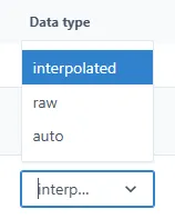
2.5.5 Data type
Section titled “2.5.5 Data type”Choose the type of data for the Serie from the Data Type dropdown. The options are Raw, Interpolated and Auto.
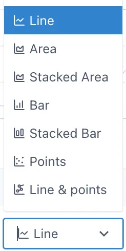
2.5.6 Chart type
Section titled “2.5.6 Chart type”By default, a new Serie is displayed as a Line. But other types of charts are available: Area, Stacked Area, Bar, Stacked Bar, Points and Line & Points.
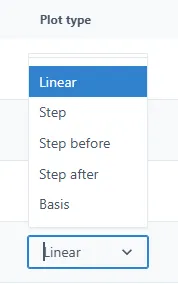
2.5.7 Plot type
Section titled “2.5.7 Plot type”By default, the chart is plotted using a line. But it is possible to display a stepped function instead. This is chosen in this setting.
2.5.8 Grouping
Section titled “2.5.8 Grouping”It is possible to group data, rather than showing every single point in the chart. For example, if there are many data per day, it is possible to show, the First point, the average, the highest or lowest and so on. This is controlled by two values: the range over which to group the data, and the data to show. These are set in the Group by and Group function fields in the Settings.
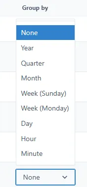
Group by
Section titled “Group by”The possible values are: None (default), Year, Quarter, Month, Week (Sunday — Sunday), Week (Monday-Monday), Day, Hour, Minute.
Group function
Section titled “Group function”The Grouping functions are: First, Last, MAX, MIN, Average, Sum, Count.
This field is disabled if Group by is set to None.