Overview
1 Overview of Dashboards
Section titled “1 Overview of Dashboards”1.1 What is a dashboard
Section titled “1.1 What is a dashboard”A dashboard is a space where you can display different types of data in a variety of widgets such as charts, levels, dials, numbers, tables etc.
1.2 Types of dashboards
Section titled “1.2 Types of dashboards”There are different types of dashboards for different case uses. In the following section we will cover the different types and case uses it is best for.
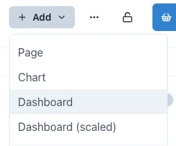
1.2.1 Dashboard
Section titled “1.2.1 Dashboard”A standard dashboard uses a responsive grid that automatically adjusts its horizontal dimensions when the screen size changes. As the screen narrows, the spacing between components decreases while text size remains consistent. This maintains readability while adapting to different display sizes.
This is the optimal choice for rapidly deploying a dashboard page containing diverse elements like metrics, textual information, charts, and other visualizations. The standard dashboard includes both horizontal and vertical guidelines and has collision prevention activated by default, ensuring components remain properly aligned and separated.
A standard dashboard works best for:
-
Information-dense displays requiring consistent text legibility across devices
-
Dashboards viewed on various screen sizes (desktop, tablet, mobile)
-
Projects needing quick deployment without custom responsive behaviors
-
Cases where preserving relative component positioning is more important than maintaining exact spacing.
1.2.2 Scaled dashboard
Section titled “1.2.2 Scaled dashboard”A scaled dashboard will scale both horizontal and vertical dimensions to the screen size, keeping the same aspect ratio regardless of the screen size. This type of dashboard does not have a visible grid, and it is ideal for dashboards with overlaying data on a background image or when using graphics.
Scaled dashboards are ideal when creating content that needs to be accessed in devices with different sizes or when designing dashboard with visual elements such as equipment graphics with overlayed indicator, text, levels, numbers, etc.
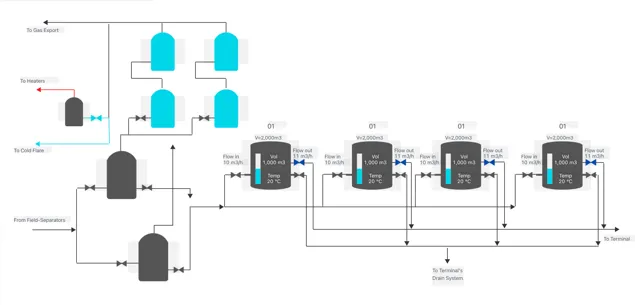
Below is an example of a scaled dashboard in both normal view and edit mode. When viewed in a smaller window, all the elements will stay aligned with the tanks in the dashboard.
Normal view:
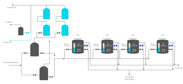
Edit mode:
1.2.3 Legacy dashboard
Section titled “1.2.3 Legacy dashboard”Adding a Legacy dashboard creates a page with an Eigen Plus Monitor (EPM) macro editor, enabling you to create tables and content just as you would in Ingenuity 6. The editor’s configuration will mirror that of the previous version of Ingenuity.
1.3 Where to find dashboards
Section titled “1.3 Where to find dashboards”The dashboards in your current and all workspaces can be easily located by clicking the “Dashboards” button on the left side menu.

If you click on it while in a workspace, it will show you the dashboards under that workspace, otherwise it will list the dashboards, the workspace they are in, last time they were updated and the user that created the dashboard.
1.4 Key features of dashboards
Section titled “1.4 Key features of dashboards”Dashboards have parameters that are set at a page level as well as a component level. These are the “Grid Settings” and “Variables”. (see Section 2.3 and Section 6).
You may want some of these page-level parameters to over-ride the settings a component (for example “Live mode”) and it is possible to set each component to inherit these settings.
1.4.1 Live Mode
Section titled “1.4.1 Live Mode”Live Mode means that the dashboard will regularly refresh with the latest data as long as it is open. The default refresh interval is 1 minute (60,000 milliseconds).
The page has a “Live Mode” toolbar that can be visible or hidden (see Section 2.3), and each component has a “Live Mode” section in its configuration. In the example below, the component is set to “Inherit time from grid settings”.
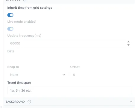
This means that the component will show the data for the time setting of the grid.
When the component is not set to inherit the time from grid settings, there are a number of options to tune the behaviour of the component to match your needs.
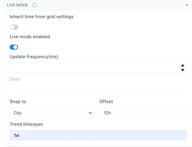
Update frequency (ms): the interval at which the component will query the data source for new information.
Date: visible when “Live mode” is not enabled. The point in time for which the component will show data
Snap to: this will force the component to show data at certain time intervals, e.g. Day, or Hour. The time will be set to the end of the most recent whole period
Offset: the offset from the end of the last whole period. In the example above, the component would always show the data for the most recent prior instance of 10:00.
Trend timespan: this determines the period of time shown in the pop-up trend when the component is clicked
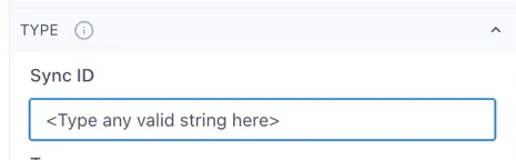
1.4.2 Component Synchronisation
Section titled “1.4.2 Component Synchronisation”Components can be linked together so that scooter bars show the same time. This applies to Charts, Sparklines and Event Tracks.
This can be useful when there are several charts/sparklines on a page, or when an Event Track is placed below a chart.
To link components, enter the same value in the “SyncID” in the “Type” configuration section for each component that you would like to link. The value can be any text string and is local to the dashboard: