

Overview
1 An Introduction to Charts in Ingenuity 7
Section titled “1 An Introduction to Charts in Ingenuity 7”Ingenuity provides capabilities to visualize data from different sources such as process data historians (InfoPlus.21, PI-System, Cognite CDF, InfluxDB), production reporting systems (EC, Mikon), OPC sources, relational databases (MSSQL, Oracle) and APIs (weather data, oil price etc).
The Charting Widget is one of many versatile and powerful visualization tools within Ingenuity that offers the following capabilities:
-
Seamlessly drill down into underlying data for deeper insights.
-
Effortlessly create custom charts with the intuitive chart builder.
-
Leverage multiple Y-axes to combine and compare diverse datasets effectively.
-
Live mode enabling real-time trending.
-
Ability to create mini-trends and sparklines that augment process graphics and dashboards.
2 Creating a new Chart
Section titled “2 Creating a new Chart”2.1 Creating a new Chart
Section titled “2.1 Creating a new Chart”There are two really simple ways to create a new Chart.
-
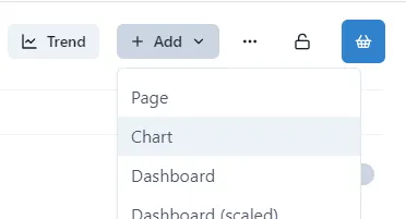
Click the Add button at the top of the Home page, and select Chart from the drop-down
-
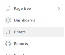
Click Charts in the left-hand menu
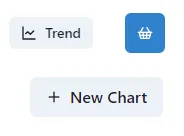
and then click New Chart in the top right-hand corner
2.2 What’s on the Page?
Section titled “2.2 What’s on the Page?”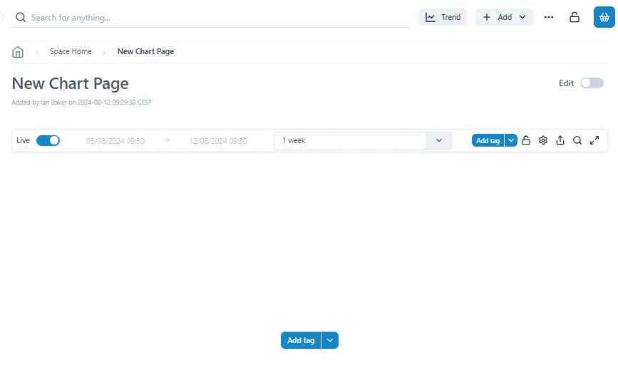
The New Chart page contains just the title bar and a blank chart. The first thing to do it add a series to the chart
2.3 Add the First Tag
Section titled “2.3 Add the First Tag”To add a Tag to a Chart, simply click either of the Add Tag buttons.
![]()
There are two parts to the button: the ‘Add tag’ text on the left, and the V dropdown on the right.
- ‘Add tag’ button:
The ‘Add tag’ button is used when tags to be added to a chart come from a historian data source.
Click on Add tag to search for and select a tag
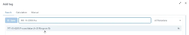
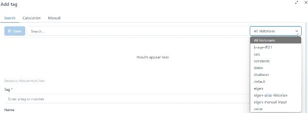
If searching for a tag within a specific historian, select a historian from a dropdown then search for and select a tag.
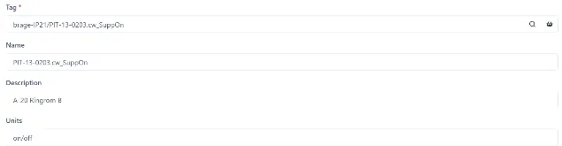
As an option, once a tag is selected Name, Description and Units retrieved from a data source can be modified by a user.
Click Save to add a tag to a chart.
- ‘Add tag’ V Dropdown:
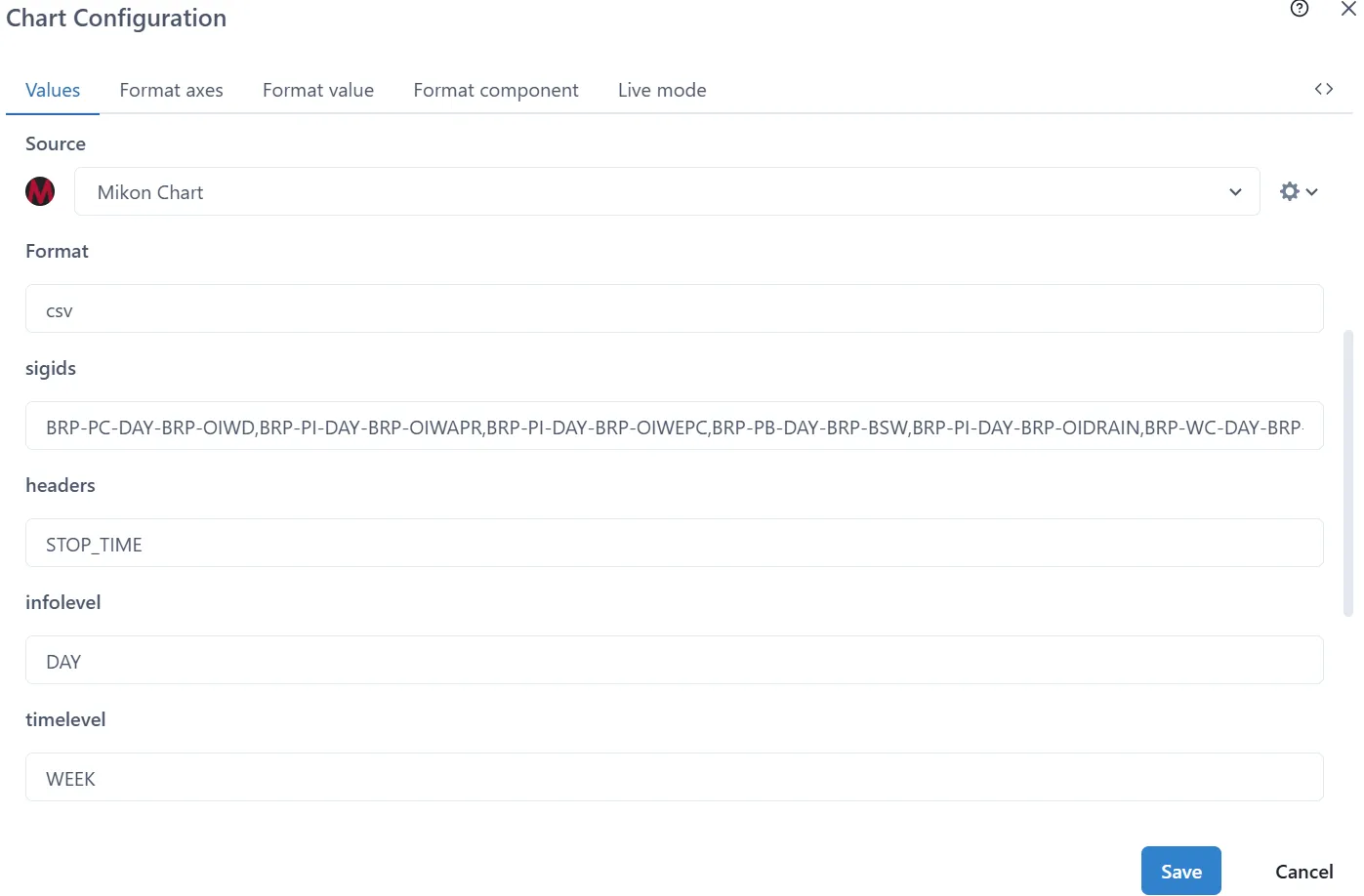
The V dropdown is used when tags to be trended come from either historian or non-historian data sources. Each data source will have data source specific configurations.
Click the V dropdown to select one of the configured data sources.
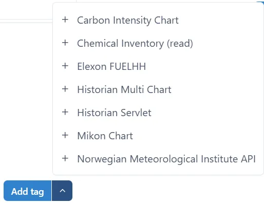
Fill out the data source specific chart configuration parameters. The example below shows Norwegian Meteorological Institute API :
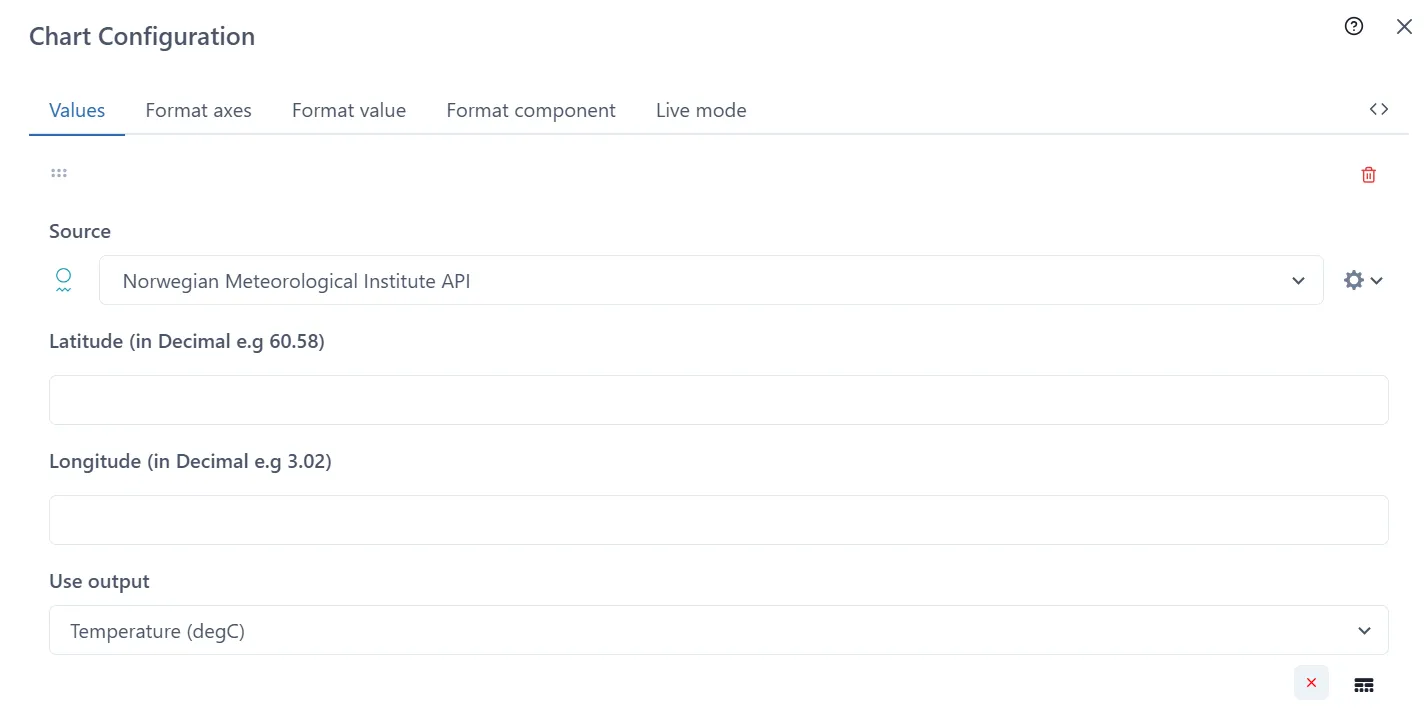
Click Save button when done

2.4 Adding more Tags
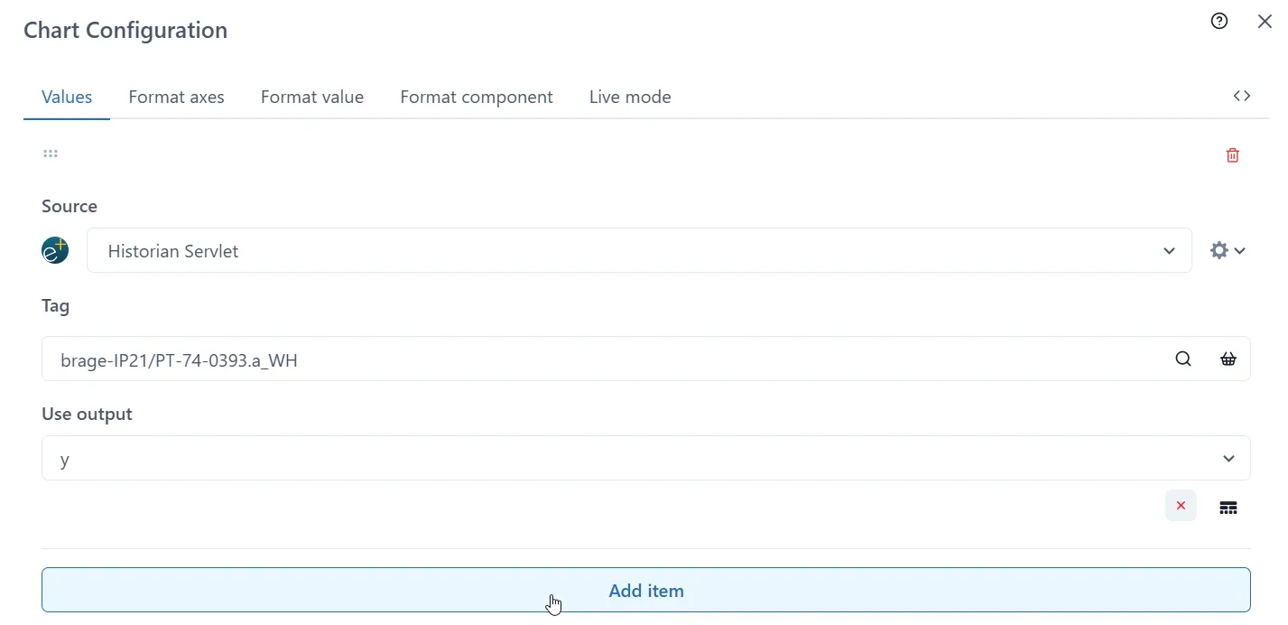
Section titled “2.4 Adding more Tags”To add more than one tag to a chart Click the V dropdown and select one of the data sources listed. The example below shows Historian Servlet:
Click on the magnifying glass icon to search or the basket to select saved tags
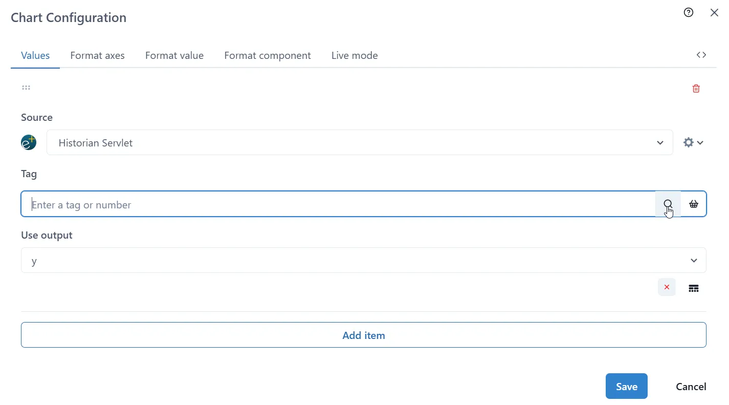
Once the first selection is made, click ‘Add item’ button. New section will be added to the form each time ‘Add Item’ is pressed.
Keep the previous Source or select a new one from the dropdown menu.
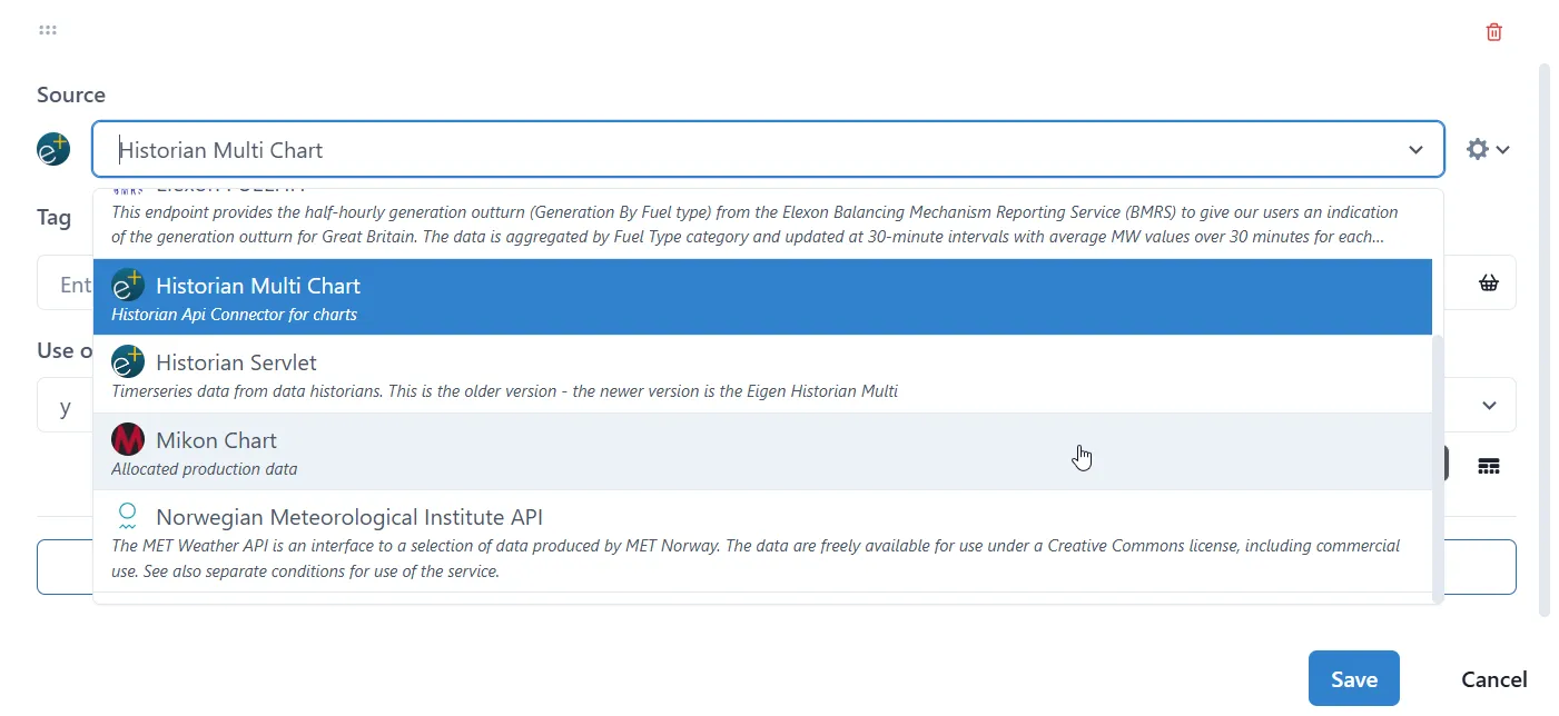
The form appended depends on the type of Source selected.
Once the process is repeated for every tag, press the Save button.