

Introduction to Ingenuity 7
GLOSSARY
| KPI | Key Performance Indicator, also used as a generic term for visualisation components on a dashboard (e.g. Dial, Gauge, Status Indicator etc.) |
| AWS | Amazon Web Services |
| VM | Virtual Machine |
| URL | Universal Resource Locator |
| SQL | Structured Query Language |
1 An Introduction to Ingenuity 7
Section titled “1 An Introduction to Ingenuity 7”Ingenuity is Eigen’s digital platform for Engineering and Industrial Operations. It is built by Engineers, for Engineering and Asset Managers to make working with data a joy. The Ingenuity platform was first written in 2009 and now, 15 years on, Ingenuity 7 is a major new release; a complete re-write from the ground up to include the latest and best technology and incorporate all the learnings we have from over 17 years deploying digital capability for Oil & Gas, Energy, Chemicals and Manufacturing industries. It’s faster, more secure and more intuitive than ever before.
There is a publicly accessible demo of Ingenuity 7 available at https://ingenuity-sandbox.eigen.co/.
1.1 What is Ingenuity
Section titled “1.1 What is Ingenuity”Eigen Ingenuity is a digital platform for getting value from data, improving decision making and automating labour intensive work processes.
It is a layer on top of existing systems and makes it easy way to combine, visualise, publicise and share information from existing systems through online charts, dashboards, reports and automate workflows.
There is no requirement to copy data to a data lake or replace the underlying systems. It is also agnostic, so it is easy to roll out capability across sites with different systems.
1.2 System Licensing
Section titled “1.2 System Licensing”Ingenuity is a cloud-native application and supports multi-tenancy.
Cloud-native means that it is “containerised” to run in a virtual environment (Kubernetes) and is not installed directly onto hardware. It does not mean that it has to be installed in the cloud - it can be installed on-premise on local virtual machines (VM’s) or in a cloud environment such as Microsoft Azure or Amazon AWS.
Multi-tenancy means that a single install can support multiple concurrent subscriptions. A “Subscription” is a digitally segregated set of users, content, datasources and modules.
Ingenuity is licenced “per subscription” and any module licencing applies to that subscription only.
In most on-premise installations there will only be 1 subscription, but the possibility exists to create multiple subscriptions if necessary, for example where a company has business units (in different countries) that must be segregated financially.
Aspects of a Subscription are managed under the Subscriptions module:
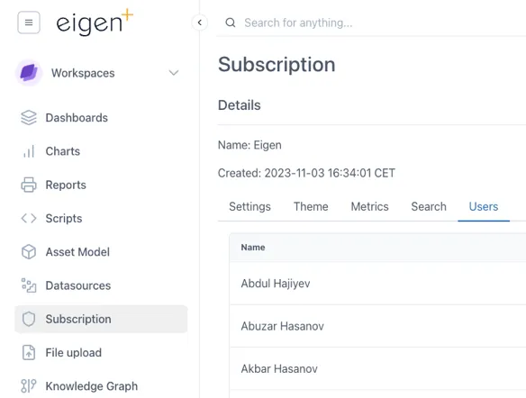
The configuration of a Subscription is managed through the Subscription Module
1.3 Modules
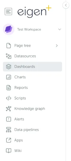
Section titled “1.3 Modules”Ingenuity is now divided into modules to make it easier to navigate and so that individual modules can be licensed separately.
The installed modules are visible on the left had side of the screen:
A summary of the available modules is presented in the table below.
The list of available modules, and if they are a separately licensed from the base install:
| Module | Details | Separate license |
|---|---|---|
| Datasources | Easy overview of all connected datasources | - |
| Dashboards | Create and view live & historic dashboards showing connected data | - |
| Charts | Create and view live and historic charts using connected data | - |
| Calculations | Create virtual timeseries using 30 drag & drop functions | - |
| Reports | Turn any dashboard into a scheduled report and send by email | Yes |
| Scripts | User configurable low code scripting for advanced functionality | Yes |
| Knowledge Graph | Query the Neo4j graph model | Yes |
| Asset Model | An intuitive user interface for browsing the Knowledge Graph | Yes |
| Alerts | Create alerts and get notified if they are triggered | Yes |
| Data Pipelines | Combine and manipulate data to provide cleaned data sets | Yes |
| Document Portal | A simple online portal for storing and searching across ad-hoc docs | Yes |
| Apps | Access to any plug-ins and custom apps | Yes |
| Wiki | Create documentation for easy access within your organisation | Yes |
| Subscription | Admin access to manage your subscription | - |
1.4 Logging in
Section titled “1.4 Logging in”There are two ways to configure the authentication in Ingenuity. This configuration must be done by Eigen during the system setup.:
-
“Single Sign On” - Connecting it to Microsoft Azure (most common); or
-
Local accounts using email & password — good for installations not connected to Microsoft
Logging in with Azure
Section titled “Logging in with Azure”Where an instance is configured to use Azure, users will see this screen on first accessing the system.
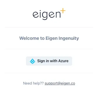
When configured to use the Microsoft Azure Authentication, users will be presented with a “Sign in with Azure” button.
Users must click “Sign in with Azure” and will then be taken through the standard Microsoft authentication process, which will include 2-Factor authentication (such as via Authenticator) if they have set this up.
Logging in with a local account
Section titled “Logging in with a local account”Where local Ingenuity accounts are used, users will be presented with fields to enter their email address and password, as well as a link to reset their password if they have forgotten it.
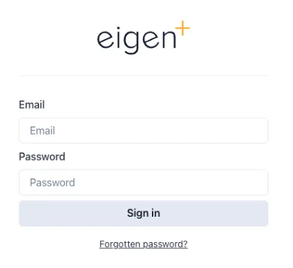
Where local accounts are enabled, users must enter their email address and password.
1.5 User Permissions
Section titled “1.5 User Permissions”There are three basic levels of access available:
-
Admin — can manage users and access
-
User — can view and create content
-
Anonymous
Admins and Users can be added to Groups to make it easy to configure access to Workspaces and other content:
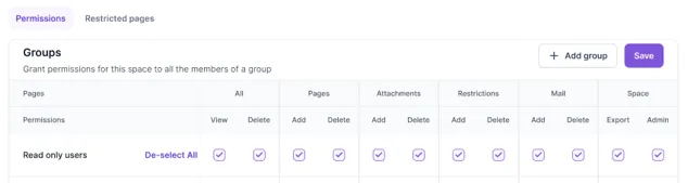
Within a Subscription, user access can be restricted to Workspaces and down to a Page level.
1.5.1 User Management
Section titled “1.5.1 User Management”Users are per-subscription and are managed under the Subscriptions module (Section 2.12).
1.6 Navigation
Section titled “1.6 Navigation”The first page a user will see when they log in is the landing page (for the Subscription they have logged in to if in multi-tenancy mode):
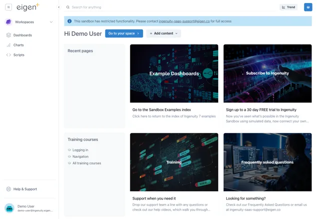
This page gives quick access to recent pages, training courses and four panels with current news or events of interest to users in that Subscription. The content of these four panels is specific to a Subscription and is managed by System Administrators in the Ingenuity Hub (see section 3.2).
1.6.1 Screen areas
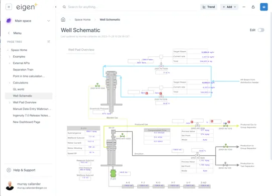
Section titled “1.6.1 Screen areas”To make it more intuitive, the screen is now divided into different areas, so that users always know where to look to find the function they need.
Components along the top are always visible unless in Kiosk mode.
Top right
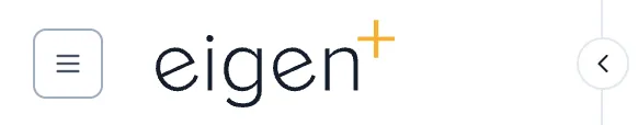
Section titled “Top right”Clicking the site logo will take a user back to the site home page.
Clicking the hamburger button on the left shows the Quicklinks menu.
This is a user configurable, user specific, menu of shortcuts to Ingenuity content or other URLs:
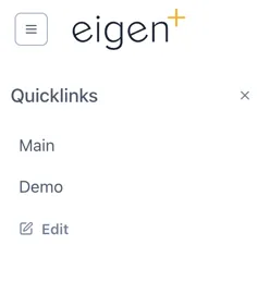
Clicking “Edit” lets a user add and manage their Quicklinks.
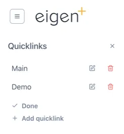
Administrators can set site (Subscription) wide Quicklinks in the Ingenuity Hub
The [<] arrow to the right of the site logo will collapse the side bar so that only the icons are visible.
Top middle
Section titled “Top middle”The Search bar lets users quickly search for data, content or objects in the Knowledge Graph.

The Trend button instantly brings up a blank trend

When the user is on a page that they have edit permissions for, three additional buttons will be visible to Add content, manage content, and manage permissions:

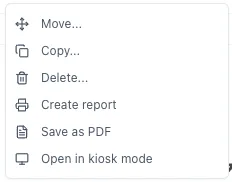
The Manage Content is behind a button with three dots […] to signal that there are more options here. The available options depends on the content of the current page and the user permissions:
Top Right
Section titled “Top Right”The Basket is a way to collect references to data and information that you would like to refer back to.

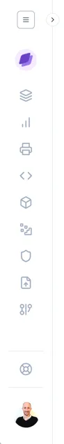
Left hand panel
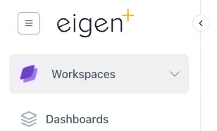
Section titled “Left hand panel”The left hand panel is the main way to navigate within the system. At the top is the Workspace selector (see 1.6.2), access to the Page Tree (see 1.6.3) and the Modules (see section 2).
The left hand panel is the main way to navigate around the system
Bottom Left corner
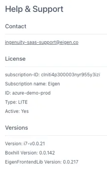
Section titled “Bottom Left corner”The bottom left corner shows the logged in user and a link to the Help and Support page.
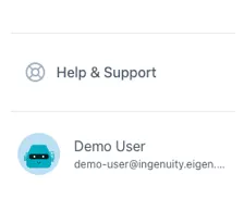
Clicking on “Help and Support” brings up a page with a link to the Eigen support desk, as well as details of the system that may be needed in the case of contacting support, such as the instance name, licence etc.
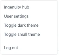
Clicking on the logged in user brings up a menu of available user-specific settings:
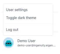
This includes being able to select the Theme (see 1.7), edit user settings and Log Out.
Superusers will have access to Ingenuity Hub
Right hand panel
Section titled “Right hand panel”The right hand panel is only visible when a page is in Edit mode. The content of this panel changes dynamically to show all the available configuration options

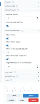
Different examples of configuration options
in the right hand panel
Bottom right hand corner
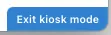
Section titled “Bottom right hand corner”There is normally nothing in the bottom right corner unless the current page is in Kiosk mode (see 1.10). In this case there is a barely visible button to exit Kiosk mode that only appears clickable when the mouse cursor is over it:
 🡪
🡪
1.6.2 Workspaces
Section titled “1.6.2 Workspaces”All content in Ingenuity is arranged in “Workspaces”. Each user has their own personal Workspace, plus shared Workspaces can be created. The Workspaces are accessed from the dropdown in the top right. A user can only access the Workspaces for which they have View or Edit permissions.
1.6.3 The Page Tree
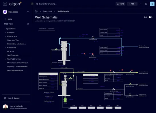
Section titled “1.6.3 The Page Tree”A Workspace is analogous to a top-level folder. The content within a Workspace is organized in a hierarchy called the Page Tree. On entering a Workspace, the user sees the Page Tree for that Workspace.
If a user has Admin rights to a Workspace, there is an edit icon visible to the right of the “Page Tree” heading. (See Manual Section 14 — Workspaces and Pages).
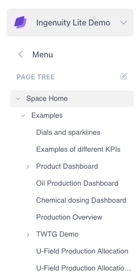
If a user has Admin rights to a Workspace, there is an edit icon visible to the right of the “Page Tree” heading. (See Manual Section 4 — Workspaces and Pages).
1.7 Themes and Modes
Section titled “1.7 Themes and Modes”Ingenuity supports multiple Themes. A Theme defines how everything appears on the screen, including the colours, fonts and logos. Each Theme has a Light mode &, a Dark mode and Normal & Small modes.
Themes are installed by Eigen but users can select the mode they would like to use by clicking on their user name in the bottom left corner.
1.7.1 Light and Dark Modes
Section titled “1.7.1 Light and Dark Modes”The system comes with default a default Eigen Theme in Light and Dark Mode Themes. The examples below show the same page in Light and Dark modes.
1.7.2 Small and normal modes
Section titled “1.7.2 Small and normal modes”The “Small” mode for a theme is useful where screen space is limited because the side bar and headings take up less room

The lower screenshot shows Small mode makes left panel and the headings take up less room.
1.8 Trending data
Section titled “1.8 Trending data”1.8.1 Quick access to trend data
Section titled “1.8.1 Quick access to trend data”Trending data is essential for engineering and production operations. Very often there is a need to quickly check something and pull up a trend. Ingenuity 7 makes trending data even quicker and easier than before, with a new “Trend” button that is always visible at the top right of the screen, as well as the proven features like fast search, the Basket and drag and drop.
Clicking the new Trend button brings up a blank pop-up trend.
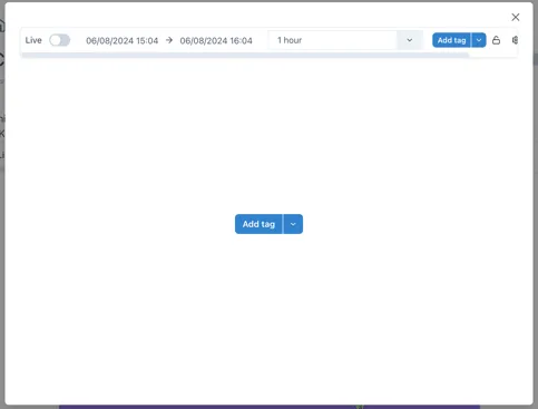
Data can be added to the trend in one of three ways:
-
Searching for a tag by clicking the [Add tag] button

-
Selecting a datasource that provides trendable data from the
 icon to the right of the Add tag button
 -
Dragging and dropping a tag from the Basket..
Other ways to bring up a trend are:
-
Clicking on a value in a dashboard
-
Clicking the “trend” icon by an item in the Basket (see section 1.9).
1.8.2 The new Chart component
Section titled “1.8.2 The new Chart component”The all new Chart component in Ingenuity 7 is more intuitive than ever.
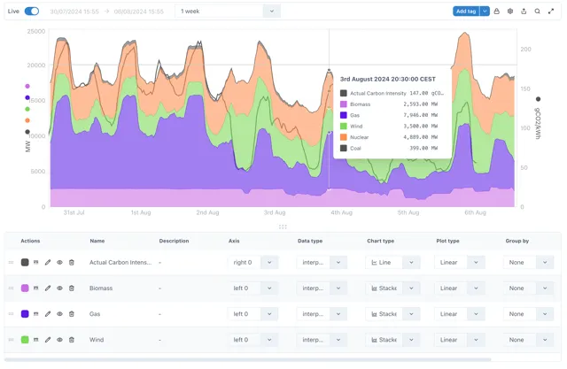
The following chart types are available:
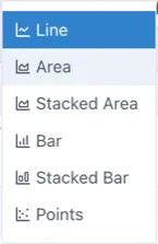
See section 2.3 below for more details, and (Product Manual - Charts).
1.9 Creating Content
Section titled “1.9 Creating Content”Everyone likes good looking visuals, especially everyone at Eigen, and Ingenuity 7 makes it even easier to make beautiful dashboards. It also makes it even easier to display these dashboards on public displays with the new Kiosk mode.
1.9.1 Adding a Page, Chart or Dashboard
Section titled “1.9.1 Adding a Page, Chart or Dashboard”When a user is in a Workspace for which they have edit permission, the
 button is visible in the top right. There
are 4 different types of content that can be added:
button is visible in the top right. There
are 4 different types of content that can be added:
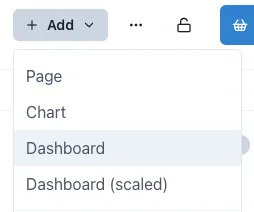
All options look similar, but they have some subtle differences. The most significant difference is the Dashboard (scaled), which does not have a visible layout grid.
-
Page: A blank web page with a layout grid to make it easy to align content. Users can add any content from the palette
-
Chart: A Chart is a Page that is tagged as a Chart (so that it appears in the Charts module) and has a full width chart component added by default. Users can add additional charts and other components in Edit mode.
-
Dashboard: A Dashboard is a blank page that is tagged as a Dashboard so that it appears in the Dashboards module.
-
Dashboard (scaled): this is a Dashboard that does not have a visible layout grid so that components can be freely placed anywhere. This is especially useful for creating dashboards with a background image where pixel level placement accuracy is required.
1.9.2 Edit mode
Section titled “1.9.2 Edit mode”In order to edit a page it must first be put in Edit mode. This is done
by sliding the toggle switch in the top right hand corner
 .
.
When the page is in edit mode, the component pallet is visble on the right, and the layout grid is visible in the page body. Components are added by dragging them from the palette and resizing them as desired. The grid will automatically extend downwards as components are added.
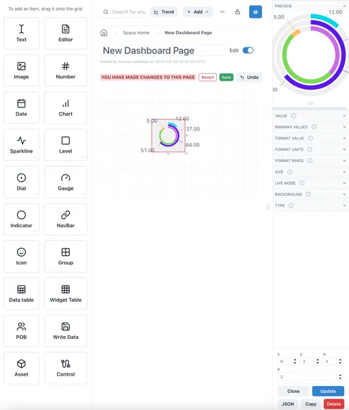
The panel on the right shows the configuration options for the currently selected component (or the grid itself).
1.9.3 Component Templates
Section titled “1.9.3 Component Templates”Many of the available components have a library of pre-configured templates. These are accessed by clicking on the three dots in the bottom right hand corned of the component box:
This will bring up a popup of the available templates.
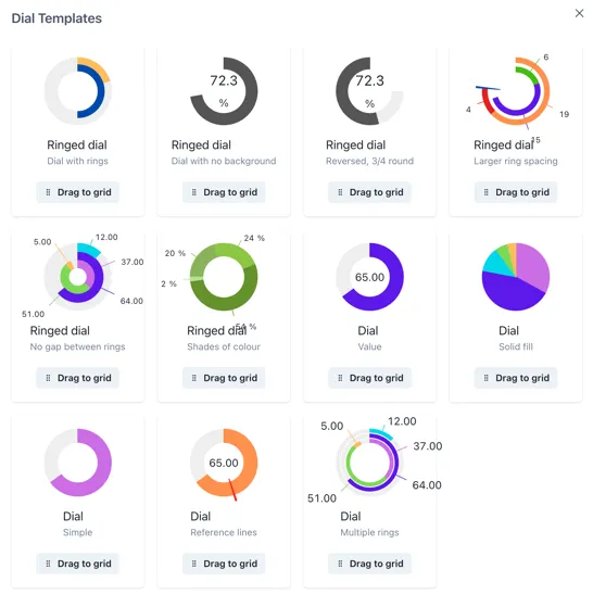
Click and hold on the [Drag to grid] button on the one you would like to use and you will be able to place it on the page grid.
1.9.4 Saving or reverting changes
Section titled “1.9.4 Saving or reverting changes”As soon as the content on a page is changed, Save or Revert buttons appear at the top:

It is possible to go in and out of Edit mode without losing changes, but changes must be saved before navigating away from the page, otherwise all changes will be lost.
1.10 Displaying content — Kiosk Mode
Section titled “1.10 Displaying content — Kiosk Mode”Kiosk Mode is used for displaying Dashboards on public displays. I removes all the application navigation and headers so that the content can take up the whole screen.
Normal view: Kiosk mode:
To exit Kiosk mode, there is a subtle button at the bottom right of the screen that only appears clickable when the mouse cursor is over it:
🡪
1.11 Collecting Data - The Basket
Section titled “1.11 Collecting Data - The Basket”The Basket is a way to collect references to data and information that you would like to refer back to.
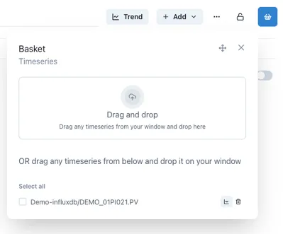
Much like the shopping basket on a website, a used can add things to their basket and come back to them later.
The Save and Load functions provide a handy way to create personal lists of useful information that is regularly accessed.
1.12 Search
Section titled “1.12 Search”The Search bar lets users quickly search for data, content or objects in the Knowledge Graph.
The search results will appear in a slide-out on the right hand side of the page.
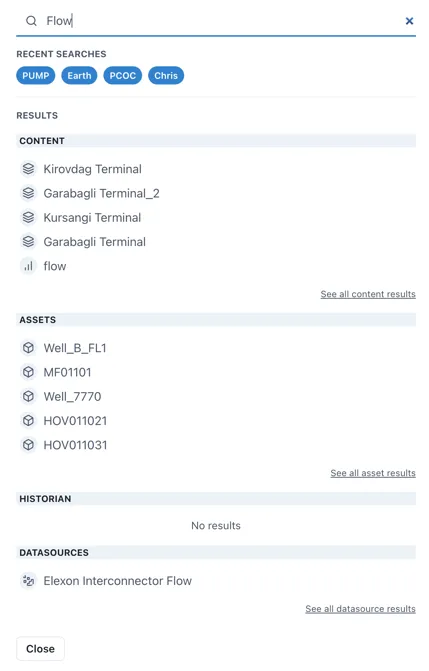
Search results are interactive and will take the user to the live instance of the result.
1.12.1 The Common Menu
Section titled “1.12.1 The Common Menu”Clicking on a result in the Assets section will bring up the Common Menu. This shows all the related information in the Knowledge Graph and includes live links to referenced information such as drawings, timeseries data and other assets.
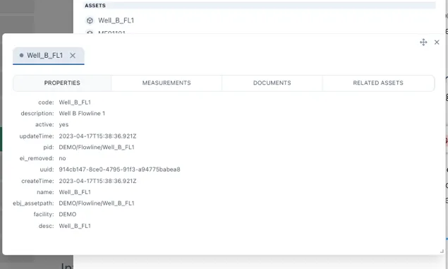
The Common Menu shows all the related information in the Knowledge Graph