

Modules Overview
2 Modules Overview
Section titled “2 Modules Overview”2.1 Datasources
Section titled “2.1 Datasources”The Datasources module shows all the data sources currently installed along with a description and examples.
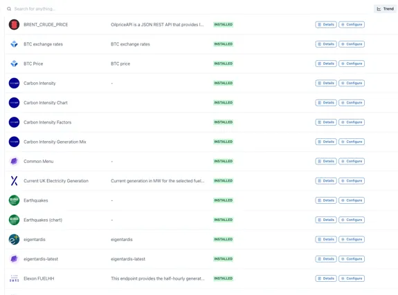
Each data source supports one or more types of display component, for example, a Chart, Value, Table etc.
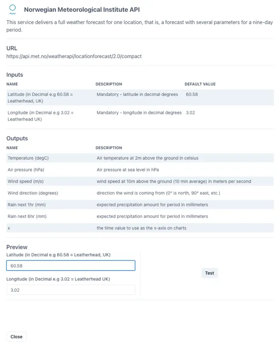
Clicking on the “Details” button to the right of any data source brings out a slider with full details of the data available plus a button to test it and see the response
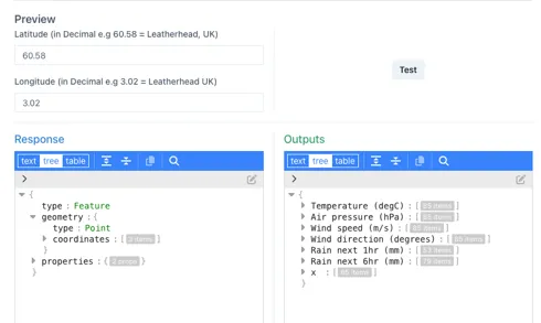
Clicking the “Test” button at the bottom right shows the direct response from the data source on the left and the refined output provided to the Ingenuity component on the right
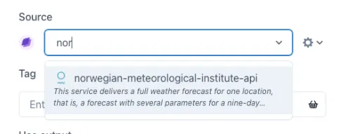
These data sources appear under the Source dropdown for configurable display elements (trend, KPI, sparkline, table etc.).
2.1.1 Types of datasource
Section titled “2.1.1 Types of datasource”There are four types of data source:
-
Value: Supports the minimum requirements to display a single value (for a point in time) in a KPI
-
Multi Value: Provides set of single value outputs at point in time, for display in a KPI. For example temperature, pressure & rainfall for a given location.
-
Table: Provides a data set that can drive a table. i.e. fields that can be assigned to columns with a variable number of rows
-
Chart: Provides a data set with time as the x axis and one or more series for the y-axes.
The following datasource types will be added [in the future]{.underline}:
-
Map: provide a dataset that will render a map
-
Geo: provide a dataset that can be overlaid on a map
2.1.2 Categories of datasource
Section titled “2.1.2 Categories of datasource”There are 4 categories of datasource:
-
Historian data sources: full featured timeseries data source that supports interpolation. Only Historian sources can be used in Calculations. Historian data sources require an Eigen Historian driver (for example IP.21, Aveva PI, InfluxDB etc.)
-
Internal data sources: these are data sources that connect to components within Ingenuity. They are used by the system but are also available to users, for example the Common Menu. Some of these data sources are “meta” data sources, in that they provide a list of available datasources.
-
Data sources that require a driver: two-part data sources that require a driver installed against the source (for example SQL Server) plus a connector to that driver from the Ingenuity UI.
-
API data sources: These can be configured directly in Ingenuity and connect to 3rd party APIs
2.2 Dashboards
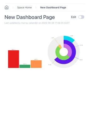
Section titled “2.2 Dashboards”The Dashboards module contains all the functionality for creating beautiful displays. Clicking on the Dashboards module displays all the dashboards in that Workspace.
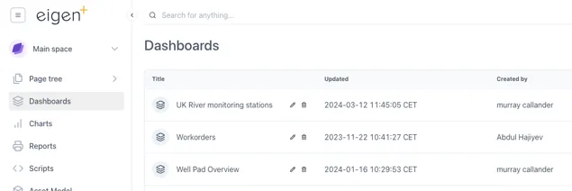
Note that these dashboards will also be listed in the Page Tree. The difference with this view is that there are Edit and Delete icons to make managing the dashboards a bit quicker.
2.2.1 Standard vs Scaled dashboards
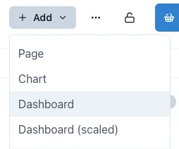
Section titled “2.2.1 Standard vs Scaled dashboards”There are two types of dashboard that can be selected in the “Add” content dropdown:
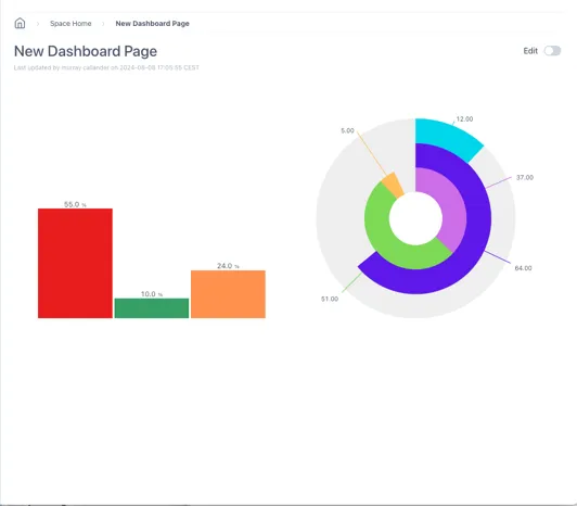
Standard dashboards have a grid and will scale the horizontal dimension only. This means that the spacing between components will be reduced but the text size will remain the same size.
Scaled dashboards will scale both the horizontal and the vertical dimensions. This keeps the aspect ratio the same and is better for keeping everything visible as the screen size changes.
The example below shows the effect of the two different settings on a simple dashboard as the width of the screen is reduced
A simple dashboard with a Level and Dial:
When the width of the window is reduced, the scaled dashboard keeps the same aspect ratio:
Standard:
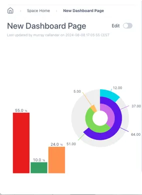
Scaled:
2.2.2 Adding Components
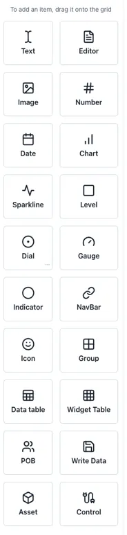
Section titled “2.2.2 Adding Components”Components are added to a dashboard by dragging them in from the left-hand panel. The following components are available:
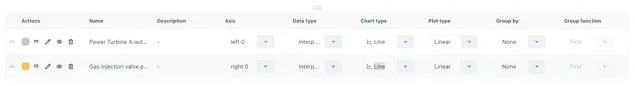
| Component | Notes | Datasource |
|---|---|---|
| Text | Simple text box for titles & labels | n/a |
| Editor | Inline text editor with formatting for ad-hoc entry in the page | n/a |
| Image | Display an image on the page | n/a |
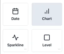
| Number | Display a formatted number | Value |
| Date | Display a date | Date |
| Chart | The full chart component | Chart |
| Sparkline | Simple trendlines | Chart |
| Level | Vertical or horizontal level indicator | Value |
| Dial | Round indicator | Value |
| Gauge | Dial with needle | Value |
| Indicator | Status indicator, e.g. on/off — shapes or text | Value |
| NavBar | Configurable navigation bar | n/a |
| Icon | Insert from a library of icons | n/a |
| Group | Insert a grouping object | n/a |
| DataTable | Insert a table with number of rows driven by the data source | Table |
| Widget Table | A table of other components | Value |
| POB | A People On Board display (if licenced) | POB |
| Write Data | Button to write data back for write enabled components | Writeable value |
| Asset | Display an object from the Knowledge Graph | KnowledgeGraph |
| Control | Advanced function that can interact with variables and update other components | n/a |
2.3 Charts
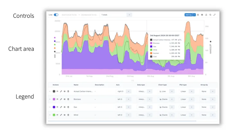
Section titled “2.3 Charts”The all-new Ingenuity Chart module is more powerful and more user friendly than ever. A significant change from Ingenuity 6 is that there is one unified chart component that covers all use cases from sparklines to full page charts. The means that all the same charting options are available for both sparklines and full charts.
2.3.1 Chart controls
Section titled “2.3.1 Chart controls”The time range selection and controls for the component are all located in the bar at the top.
2.3.2 Live mode & setting the time range
Section titled “2.3.2 Live mode & setting the time range”By default, new charts are in Live mode, which means that the right hand side of the chart will be set to the current time and will update every minute.
The time range of the chart can be change by users on the left hand side of the top bar.
Live mode
Section titled “Live mode”In Live mode there is a dropdown with pre-configured intervals or a custom interval can be typed, e.g. 3w = 3 weeks.
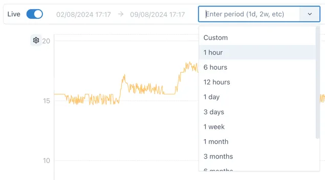
The following are valid entries for time periods:
s: seconds
m: minutes
h: hours
d: days
w: week
y: year
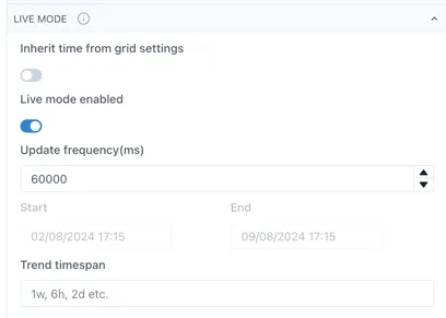
The update frequency for Live mode is configurable in the Live mode section of the chart configuration:
Fixed mode
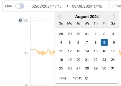
Section titled “Fixed mode”When Live Mode is deactivated, the chart will not update automatically and an exact start and end time can be selected using the time and date pickers:
2.3.3 Adding data
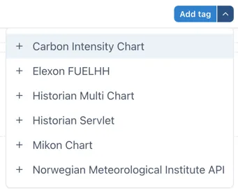
Section titled “2.3.3 Adding data”Data is added to a chart by either dragging and dropping it from the basket, or clicking the Add tag button
Clicking the arrow on the right side of the Add tag button shows a list of non-Historian data sources that support the Chart type.
2.3.4 Zooming in and the Lock function
Section titled “2.3.4 Zooming in and the Lock function”By default the chart area is “unlocked”. This means a user can click and drag to select an area to zoom in on an area of interest.
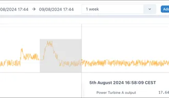
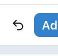
Once zoomed in an undo button appears next to the “Add tag” button to let the user quickly zoom back out.
It is possible to zoom in multiple times and the undo button will revert the zooms one at a time.
When the cursor hovers over an axis, the pointer will change to a hand. This shows that the axis can be:
-
zoomed in and out by scrolling the mouse wheel; or
-
shifted up or down (or left/right for the x-axis) by clicking and holding and then moving the mouse.
Sometimes this interactivity is not desirable and so it can be turned off by clicking the lock icon to “Lock” the chart:
 🡪
🡪

2.3.5 Chart Settings Menu
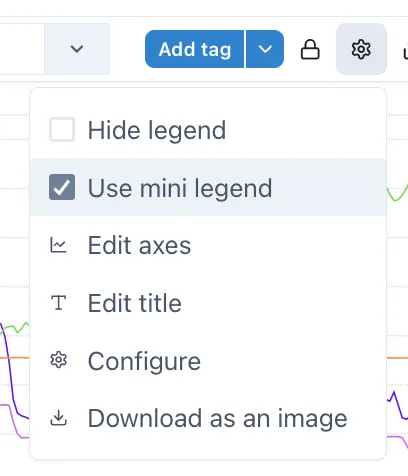
Section titled “2.3.5 Chart Settings Menu”The cog wheel icon on the right of the controls gives access to the Settings menu:
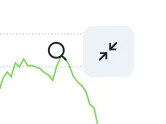
2.3.6 Chart pop-out
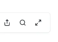
Section titled “2.3.6 Chart pop-out”The magnifying glass will cause the chart to open in a full screen popup window to make it easy to inspect the data in more detail.

Changes in the pop-out chart will not affect the underlying component.
2.3.7 The Legend
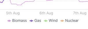
Section titled “2.3.7 The Legend”Users can configure how a series is displayed in the legend at the bottom of the chart.
Everything from line style to chart style and axis can be configured here.
2.3.8 Hiding and minifying the legend
Section titled “2.3.8 Hiding and minifying the legend”The legend can be hidden or minfied via the settings menu, make the chart cleaner better looking in reports and dashboards.

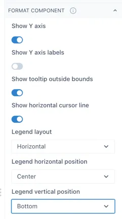
Selecting “Use mini legend” in the Settings menu shows a neat
When the legend is in “mini” mode, it’s position can be set in the “Format component” section in the Configuration.
2.3.9 Adding markers and comments
Section titled “2.3.9 Adding markers and comments”Pressing the space bar while the cursor is over the chart area will place a marker where the cursor is.
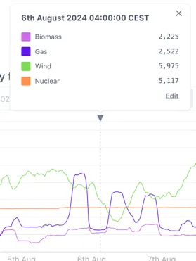
Comments can be added to this marker by clicking the the triangle at the top of the marker and then clicking “Edit”.
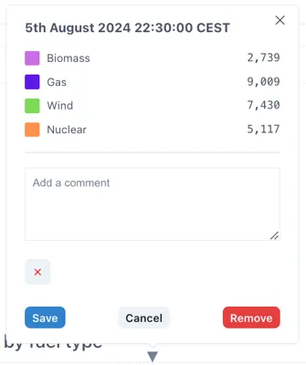
Comments are saved locally on within the page (so will be visible to anyone else who views the page) but are not written back to the source data.
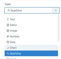
2.3.10 Charts vs Sparklines
Section titled “2.3.10 Charts vs Sparklines”Although the component is the same behind the scenes, sparklines are presented as different components when adding to a page because they have a different set of default parameters (for example all the controls and the legend are hidden):
Charts can be converted to sparklines, and vice versa, in the Type selection in the component configuration:
2.3.11 Seamless mode
Section titled “2.3.11 Seamless mode”Seamless mode hides the top bar with the controls to prevent users changing the time range and to make the chart look clean and neat in dashboards and reports:
This is an example of a chart in seamless mode with a mini-legend.
To exit seamless mode, a button appears when the cursor is over the top right corner of the chart.
2.4 Calculations & Synthetic timeseries
Section titled “2.4 Calculations & Synthetic timeseries”Synthetic timeseries are datasets that are either derived based on existing data (for example taking an average), a generated set of points based on a constant or function, or functions on dates. There are four different souces of synthetic timeseries. These are listed below along with their historian prefix:
-
Calculations — calc/
-
Constant values — value/
-
Date values — dates/
-
Generated signals — siggen/
2.4.1 Calculations
Section titled “2.4.1 Calculations”Calculations apply “in-line” transforms to any timeseries data source connected to Ingenuity. There are 30 functions covering everything from simple mathematical operators (Add, Subtract, Multiply, Divide etc.), through to more complex Totalisers and statistical functions like Average and Standard Deviation, logical If..Then functions and complex transforms such as Timeshifting.
The Calculations module is not shown in the left-hand panel because it behaves as a Historian datasource. It is accessible from any component that can take a Historian datasource.
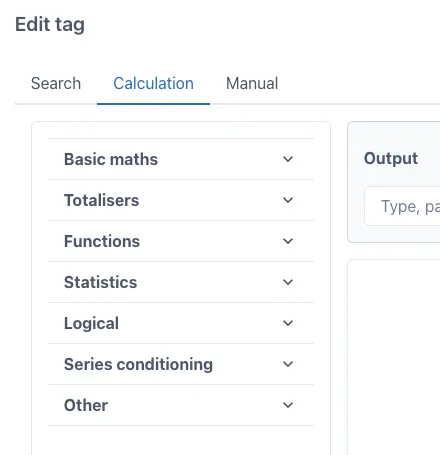
Available functions
Section titled “Available functions”The list of functions is shown below. See the dedicated chapter on Calculations for full details.
| Add | Log | Sum |
|---|---|---|
| Subtract | Power | DIFF |
| Multiply | Average | Maximum |
| Divide | Count | Minimum |
| Percent Deviation | Number of Bad Points | Mean |
| Totalise | Number of Good Points | Median |
| Totalise Raw | Standard Deviation | Standard Deviation |
| Exponential | Variance | Variance |
| Natural Log | Minimum | If Tag Exists |
| Square Root | Maximum | If Equals |
| Stepped | Timeshift | Epoch_Ms |
| Stepped Raw | Point in Time |
Creating Calculations (accessing the Editor)
Section titled “Creating Calculations (accessing the Editor)”The Calculation graphical editor is on the “Calculation” tab in the “Edit tag” form.
This form appears when the “Add tag” button is clicked on a trend:
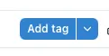
Or when the magnifying glass icon is clicked on the right hand side of the tag datasource entry field when editing a tag on a trend or dashboard:
Editing the Calculation Equations
Section titled “Editing the Calculation Equations”Ingenuity 7’s virtual calculation graphical editor is an easy-to-use drag-and-drop user interface in which any Ingenuity user can quickly configure complex calculations while minimizing human error.
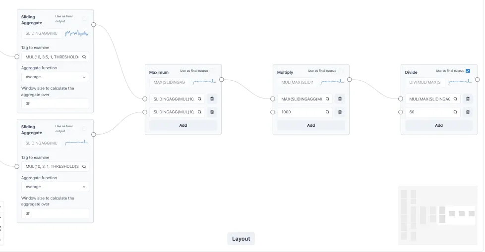
Function blocks are dragged and dropped into a canvas, after which, inputs and outputs can be connected to compose any complex transformation.
Calculations can be linked together to form complex expressions multiple layers deep, and the performance remains fast.
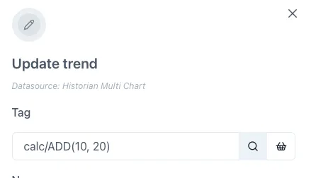
2.4.2 Constant values — value/
Section titled “2.4.2 Constant values — value/”The “value” historian returns a trendable timeseries for constant values. This is useful for displaying reference values on a chart or KPI.
For example, to display a line at 90 on a chart, the following series can be plotted:
value/902.4.3 Date values — dates/
Section titled “2.4.3 Date values — dates/”The “date” historian returns date information about values or relative times. The functions available are:
-
IS_TODAY - Return 1 if given timestamp is today
-
IS_BEFORE_TODAY - Return 1 if given timestamp is before midnight of today
-
DAYS_IN_MONTH - Return number of days in month
-
CURRENT_EPOCH_MS - Return wall clock time in epoch ms
All time values are in epoch milliseconds, which
2.4.4 Signal Generator — siggen/
Section titled “2.4.4 Signal Generator — siggen/”The Signal Generator historian generates synthetic timeseries of known wave forms such as Sine & Cosine, or repeatable random numbers. The syntax is
Syntax is (without the spaces):
\[function\]\[amplitude\]\[+/- y-offset\]@\[period\]\[+/- x-offset\]The x-offset is in seconds from GMT and [does not]{.underline} account for daylight savings adjustments.
For example, a sinewave of amplitudes -10 and 10; offset by -30 (i.e. between -40 and -20), with a period of 600 seconds; offset by -3600 seconds (1 hr) from GMT
sin10-30@600-3600The wave forms available are:
-
sin (sine)
-
cos (cosine)
-
saw (saw wave)
-
sq (square wave)
-
sc (S-curve)
-
rand (repeatable random number)
2.5 Reports
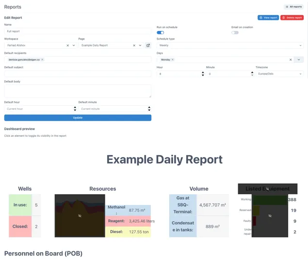
Section titled “2.5 Reports”The Reports module is the solution to automating the creation and distribution of regular reports. It lets users turn any dashboard into an issued report. It also enables auto-creation of the report on schedule.
2.5.1 Creating and scheduling reports
Section titled “2.5.1 Creating and scheduling reports”The example below shows a report scheduled to run on Monday’s at 08:00. It is based on a dashboard and some of the content is marked as hidden so that it will not be included in the issued report.
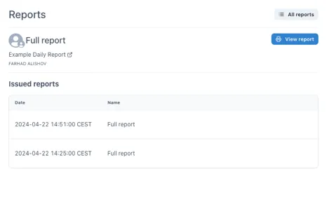
2.5.2 Viewing issued reports
Section titled “2.5.2 Viewing issued reports”When a report is issued the data is snapshotted into the report and is no longer live. This means that the report will always show the data at the time it was issued and cannot be changed (without leaving an audit trail). The history of issued reports is easily accessible.
2.6 Scripts
Section titled “2.6 Scripts”Scripts are essential for automating workflows and making more advanced functionality. The Scripts module in Ingenuity is NodeRedTM; a flow-based, low-code development tool for visual programming .
NodeRedTM is the next evolution of Excel for engineers.
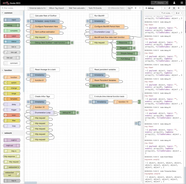
Scripts can be created to do all kinds of tasks from importing data, checking data, combining data, performing actions and exposing new APIs.
NodeRedTM is a Node.js based application and the functions are written in JavaScript, which is very easy to learn.
Examples of workflows that can be created quickly are:
-
Check if data has changed and run some logic
-
Run every 5 minutes to calculate the amount of fluid that has been removed from a tank
-
Read data from one system, cleanse and process it and write an output to another system
2.7 Knowledge Graph
Section titled “2.7 Knowledge Graph”Hosted in Neo4j, the Knowledge Graph is a digital map of information and how it is related (sometimes called Contextualisation).
It is a semantic graph and can be used to model anything, for example facilities, regions, systems, equipment, roles, maintenance, manufacturers, suppliers, spares catalogues etc.
Semantic means that it addes meaning to information.
It can include non-physical objects like systems, areas, barrier hierarchy, maintenance plans, FEMA failure modes.
It can hold links to information in other systems such as sensor data, documents, drawings, certificates, procedures and there is the possibility to include dynamic information such as work orders.
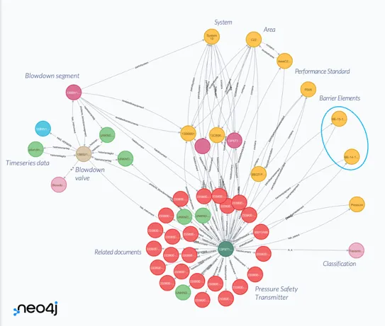
An example of part of a Knowledge Graph showing the information related to a Pressure Safety Transmitter
The Knowledge Graph can also hold data structures that can be used to create model-driven visualisation.
The Knowledge Graph entry in the left-hand panel will give access to the Neo4j browser where the Knowledge Graph can be queried directly using Cypher.
Information on using Cypher is available at https://neo4j.com/docs/cypher-manual/current/introduction/
Information in the Knowledge Graph is used in the Search results (section 1.12) Common Menu (1.12.1) , Asset Model (2.8) and Asset dashboard component (2.2.2).
2.8 Asset Model
Section titled “2.8 Asset Model”The Asset Model tool is a simple browser for the Knowledge Graph that lets the user navigate as if it was a hierarchy.
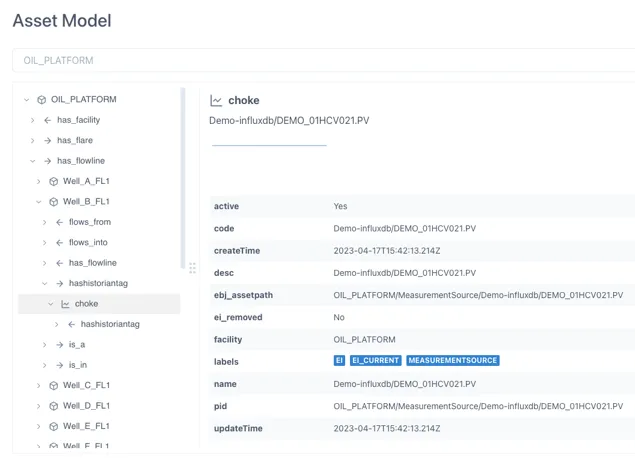
The properties for the object selected are shown in the right hand panel.
Where linked information is connected, such as Timeseries data, it is shown at the top of the right-hand panel.
2.9 Alerts
Section titled “2.9 Alerts”Users can configure checks against changes in information and receive an email or text message when the check is triggered (i.e. when it returns a True status).
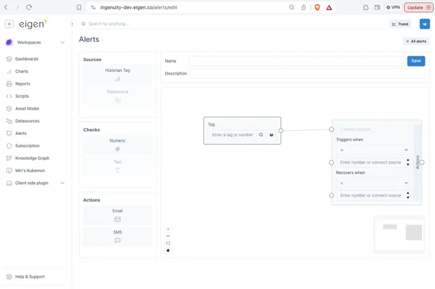
The Alerts configuration is very similar to the Calculations UI and is accessed from the Alerts entry in the left-hand panel.
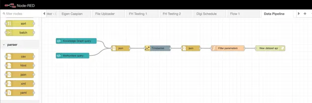
2.10 Data Pipelines
Section titled “2.10 Data Pipelines”Data pipelines are used where either;
-
Further processing is required on an existing datasource before it can be used; or
-
Data from more than one source needs to be combined to create a new dataset
2.11 Documents Portal
Section titled “2.11 Documents Portal”The Documents Portal makes it easy to consolidate all the different kinds of documents and reports that generated internally or received from 3rd parties. It automatically detects metadata such as report type and equipment and saves this in a database.
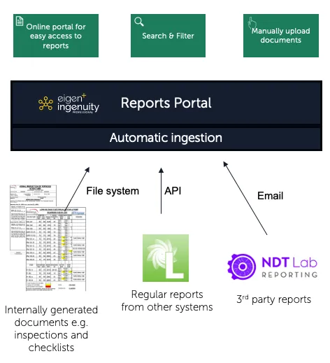
Users can easily search for reports by equipment type, date, company, area, system, location etc. All documents have a URL so can be linked to the associated work-order or scheduled inspection
2.12 Apps
Section titled “2.12 Apps”Ingenuity 7 has a new extensible architecture that supports plug-ins.
A plug-in application makes it easy to extend the functionality of Ingenuity while keeping the same authentication, look and feel and access to data sources.
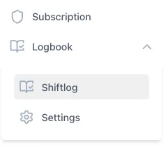
Eigen offer a continually expanding library of plug-in apps, and 3rd parties can also develop apps. For example, the Logbook plug-in can be used to create log books, for example for Shiftlogs, Valve registers, actions etc.
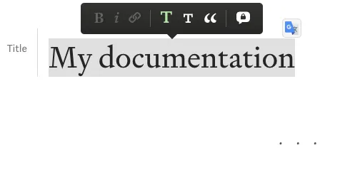
2.13 Wiki
Section titled “2.13 Wiki”The Wiki module makes it easy to create online documentation. It has a simplified page layout that makes it easy to create clean looking documentation.
2.14 Subscription
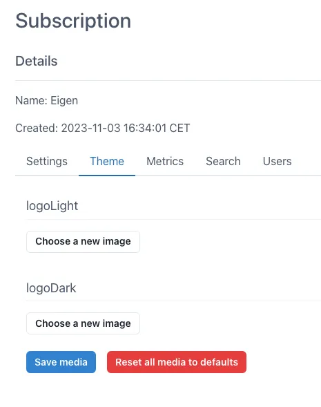
Section titled “2.14 Subscription”The Subscriptions module is only visible to Admins and is used for setting the defaults within the subscription, for example Timezone. It is also possible to change the logo and download usage metrics.
For more information please contact us at [email protected] or book a demo on our website at www.eigen.co